
How not to be fooled by viral charts
Part 1: How to spot misinformation, mistakes, and meaningless data

“The art of any propagandist and agitator consists in his ability to find the best means of influencing any given audience, by presenting a definite truth, in such a way as to make it most convincing, most easy to digest, most graphic, and most strongly impressive.” — Lenin
When I started writing this blog in late 2020, one of my first ideas for a post was called “How not to be fooled by viral charts”. I had a list of famous graphs all ready to go. But for some reason I postponed that post, and over the years, the list of charts kept growing longer and I kept putting it off.
Well, no longer. I’ve finally been so annoyed by a viral chart that I can no longer put off this post. But the list has grown so long that I’m going to have to split the post into two parts. So today we’re going to learn how to identify charts that contain misinformation — intentional deception, careless mistakes, or just generally meaningless data. In part 2 we’ll learn how to interpret charts that use good data, but which tell a story that’s more nuanced most people realize.
A very bad chart about rent vs. income
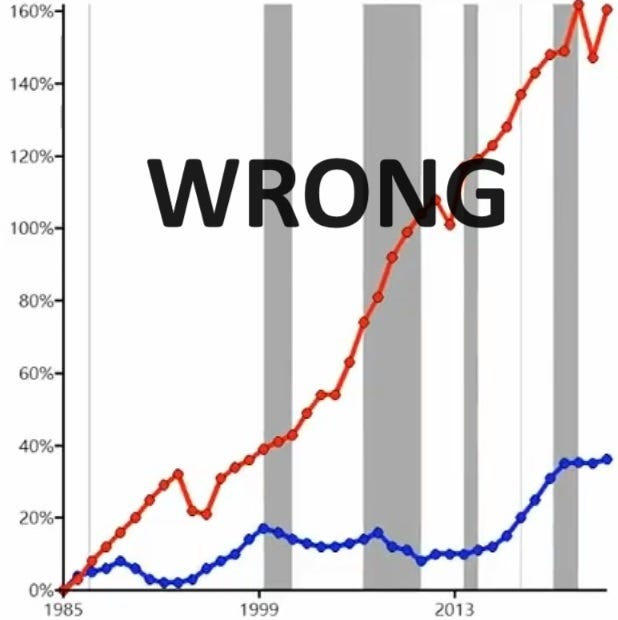
Activist and social media shouter Joshua Potash recently posted a video from TikTok that claims to show rent increasing much faster than household income since 1985:
This chart is completely wrong. Although it says “Note: Rent and income are inflation-adjusted” at the bottom of the screen, this is either a mistake or a lie. Only income is inflation-adjusted. The red rent line is not. A community note has since been added, pointing out the error, but not before Potash’s tweet was able to rack up an incredible 77,000 likes and 17,000 reposts.
Comparing an inflation-adjusted (or “real”) economic number with one that’s unadjusted (“nominal”) is one of the easiest ways to make a graph that turns heads and gets clicks but which is complete B.S. If you compare an inflation-adjusted number to one that’s not adjusted, there will be a big gap between them over time. Instead, to make an apples-to-apples comparison, you should always compare either two adjusted numbers or two unadjusted numbers.
Let’s go to FRED, the data page maintained by the Federal Reserve, and see what the true numbers are. Let’s compare median household income with the Consumer Price Index number for “rent of primary residence”, which is the standard number for average nationwide rent. And let’s set them both equal to 100 in 1985 (which is where Potash’s chart begins), so we can look at the percent increase. Here’s what we get:

There’s no big divergence here at all; the two numbers track each other very closely. Around 2007 there’s a slight divergence, and income falls a little behind rent, but they’re still pretty close by 2021, which is where the data ends.
But at least rent did go up slightly more than income, right? Well…no. In fact, household income depends on the number of people in a household. If we look at median personal income, we find that it actually went up by more than rent since 1985.

Anyway, this is not the first time this mistake has gone viral. Back in 2019, a Wall Street Journal article cited some data in a book by Georgetown law professor Adam Levitin, which turned out to just be the old “nominal vs. real” mistake:

Similarly to Potash’s chart, both income and home prices are labeled “real”, while actually only the income number is “real” and the home price number is actually nominal. The WSJ made its own chart of the data and tweeted it out, and like Potash they went viral. They did, however, have the decency to delete their tweets after the error was pointed out to them — though not before many influential figures had been accidentally misinformed.
So anyway, rent and income have largely kept pace with each other in America (though that doesn’t mean you can always afford to live in the place you’d prefer to live). That’s useful to know, but it doesn’t answer the deeper question: How can we avoid getting caught by charts like this? The app formerly known as Twitter now has a “community notes” feature that eventually catches most of the mistakes and misinfo in viral tweets, but TikTok has no such feature, and no easy way of calling out B.S. charts. You’re basically on your own out there, with only your wits to protect you, in a world of people who want to get your clicks and eyeballs.
Your wits, and also your friendly neighborhood econ blogger, Noah Smith. So here are a few tricks to help you spot bad data.
Be skeptical of dramatic graphs; check to see if they’ve been debunked
In general, the first rule of viral charts is that the more eye-popping and startling they are, the more likely it is that there’s something fishy going on. As they say, “extraordinary claims require extraordinary evidence.” You should always do a Potash’s chart of income versus rent is a very good example. Renters spend about 30% of their income on rent in America on average, so if rent had really doubled relative to income since 1985, Americans would now be spending 60% of their income on rent. Does that sound like something that’s actually happening? No. So his chart should have been instantly suspicious, based on the size of the numbers it was claiming.
That doesn’t mean every eye-popping chart you see is B.S. For example, here’s a graph of GDP since the year 1000 that’s probably basically right:
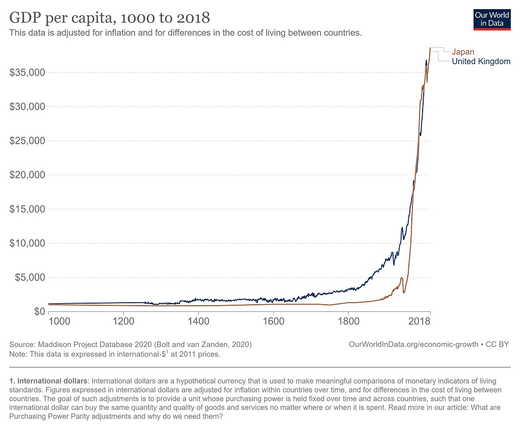
Now, there are lots of potential problems with this data (which comes from the Maddison Project at the University of Groningen). We don’t actually know the historical populations of these regions, because they didn’t keep careful records; we just make guesses based on how many people we think the available land could support. Nor do we know the actual value of economic output during this period; we just make guesses based on what we think the industrial mix was at that time in history, and how productive we think each industry was. It’s a very approximate exercise. But even if the numbers in this graph are off by a factor of 2, it’s going to look basically the same — a massive hockey stick, showing that humanity got much richer when the Industrial Revolution happened.
But in general, charts this dramatic are more likely to be embellished or massaged in some way. Something as dramatic as the Industrial Revolution is very rare! Most events in the world are pretty normal. So the more eye-popping the chart, the more inclined you should be to check it out before believing the story it tells.
The absolute easiest thing you can do to check a viral chart is to see if someone else has already debunked it. The app formerly known as Twitter is actually really good about this now, since it has a feature called “Community Notes”, in which crowdsourced corrections appear beneath the post. The community notes aren’t always right, but they usually are. Politifact and other fact-checking websites are also good at this, though they don’t always get things right either. As a third option, you can check Reddit to see if someone has already debunked the graph; Google reverse image search is very helpful for that.
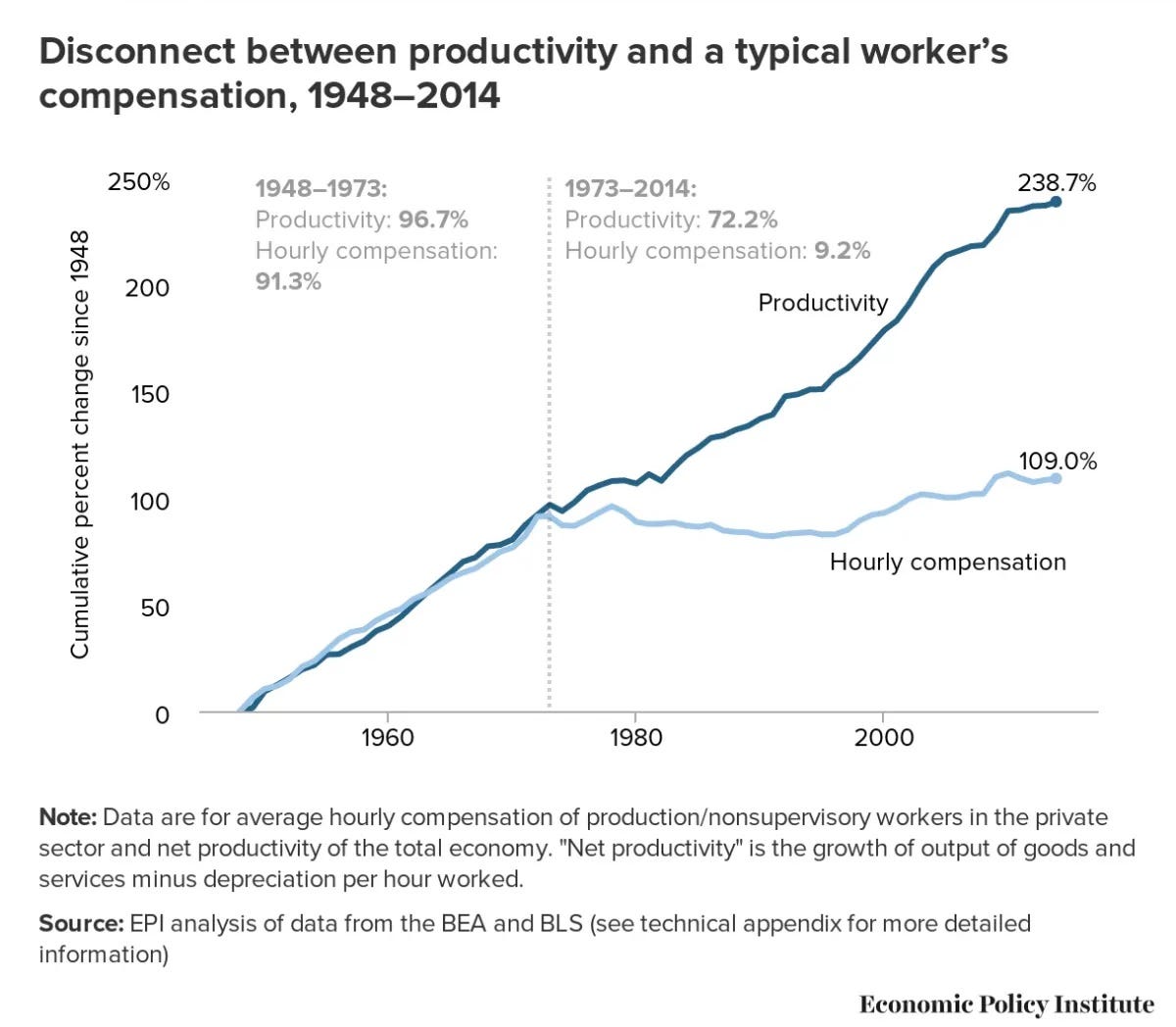
Sometimes you can actually use an old viral graph as a sanity check on a new viral graph. For example, you may have seen this chart before, since it goes viral fairly often:
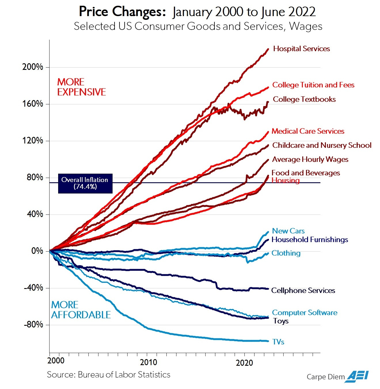
Now, I have some minor problems with the way this chart commonly gets interpreted (which we’ll talk about in Part 2 of this guide). But the data is good. And if you’ve seen it before, you might remember that the line for “average hourly wages” goes up more than the line for “housing”. Average hourly wages aren’t quite the same thing as median income, but it’s a good rough proxy. And housing prices are more than just rent, but again it’s a good rough proxy. So if you know this chart, you should be instantly suspicious of any chart that shows rent, or house prices, going up much much much faster than income.
Another good sanity check is to think through the implications of a chart. With the housing-vs.-income chart, some quick mental math showed that it claimed that rent doubled as a percent of income. A lot of charts have pretty obvious implications like that, and it helps to think through them. Even if the chart turns out not to be B.S., thinking through the radical implications will help you understand why the chart is important.
A final quick check is to look at the source for the data. If a chart doesn’t have a source for it’s data it’s a red flag. If it does, the source can sometimes give you some information about how reliable the data is likely to be. Government data sources are generally very good — there are certainly assumptions and ambiguities in government data, but generally the government has a lot of very earnest smart people doing the best they can. There are also some known bad actors like Shadowstats, whose data is completely made up and which has been debunked many, many times. A lot of data doesn’t fall into either of those categories, but
A “standard checklist” of criticisms isn’t very helpful
One thing that I find is not very useful is to have a standard list of things to be instantly critical of. Failure to adjust for inflation is indeed a very common source of misleading charts, so it’s always good to check. But because this is already widely known, you get a lot of people yelling “What about if you adjust for inflation?” at charts that are inflation-adjusted. And you get sloppy or unscrupulous people slapping an “adjusted for inflation” label on data that isn’t inflation-adjusted, as with the two housing-and-income graphs above.
Two other rules of thumb that often fail people are 1) median vs. mean, and 2) per capita. A lot of people know that averages (means) are susceptible to outliers, such as when Elon Musk walks into a bar and immediately the average wealth goes up by a factor of 100. So a lot of people who are concerned about inequality have taken to demanding that everyone use medians instead of averages for everything. But averages are often perfectly fine measures — if you’re looking at average calorie consumption, or average time spent playing video games, there’s really no need to use a median. There are only 24 hours in a day, so there’s no Elon Musk of video game time (no, not even that one friend of yours). Medians, meanwhile, tend to be difficult and slow to measure, so they’re often unavailable.
As for “per capita”, yes there are charts that ought to be adjusted for population that aren’t. This is especially common for maps; a map of the U.S. that shows total milk consumption, or total dog ownership, etc. will just be a map of America’s big cities. To make that map useful, you should look at per capita milk consumption or dog ownership. But there are some charts where per capita really isn’t the important thing. For example, a lot of people will look at a chart of total carbon emissions by country and immediately yell “But what about per capita?!”. But the climate doesn’t care about per capita emissions, only total; Kuwait’s per capita emissions are more than three times as high as China’s, but Kuwaiti policy is basically irrelevant to the future of the planet, while Chinese policy matters a whole lot.
Finally, I find that a bad way to check a graph is to look at the replies or blog comments. There will always be someone rushing to call a chart B.S., but these quick comebacks aren’t properly crowdsourced — they’re not vetted like Community Notes or upvoted like Reddit posts, and the people making them are often uninformed and/or biased.
For example, if you post a graph of carbon emissions by country, someone will always rush in to claim that China’s emissions are much larger than America’s because the U.S. outsourced our polluting industries to China. This is simply a myth; the U.S. consumes just about as much emissions as it produces, as does China, and the small gaps between consumption and production based emissions haven’t changed over time. But people keep making this bogus criticism. So watch out for faux debunks.
Anyway, that all being said, there are some good rules of thumb you can use to help you avoid being tricked by viral charts. But they’re not checklists of standard criticisms to just fire off without thinking; they’re rules of thumb for how to think on your own about the charts you see.
Understand what you’re looking at
The first thing you should know about any chart is what it’s measuring. If an axis isn’t labeled, it’s a big red flag. In fact, some charts aren’t really charts at all, but simply visual depictions of vague ideas made up to look like charts.
Next, make sure you actually understand the axis label — if it’s some vague thing like “National Awesomeness Index”, or some indecipherable variable name, make sure you know what that number means before you draw conclusions from it.
For example, here’s a very famous chart from Oxfam, claiming to show that rich people are responsible for most of the world’s emissions:
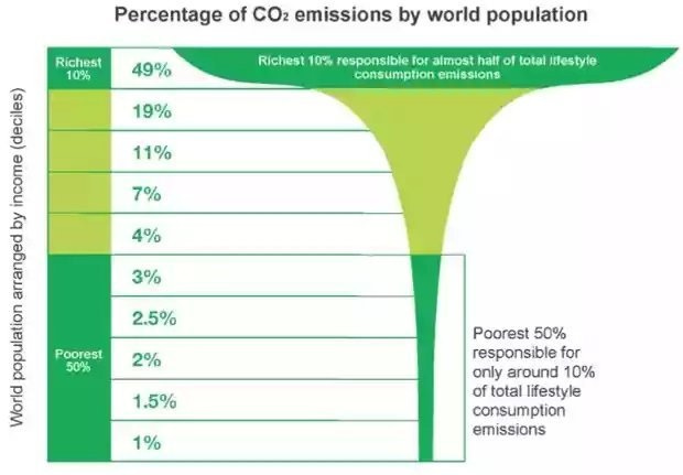
This chart regularly goes viral, so it’s important to understand why it’s basically meaningless. There are many problems with the chart, but the biggest problem is that despite the title, it doesn’t actually show CO2 emissions at all. Instead what it shows is “lifestyle consumption emissions”, which is something that Oxfam made up. See how the graph is a perfectly smooth curve instead of a bumpy jagged bar or line? That’s always a very strong hint that what you’re looking at isn’t actual data, but the output of a model.
As far as I can piece together, here’s what Oxfam did. First they made a whole bunch of wrong assumptions about where carbon emissions come from, such as assuming that income equals consumption (wrong!), that poor people consume the same kind of stuff as rich people (wrong!), that the amount of emissions per dollar of consumption follows some particular function that they made up, and so on. They then ignored government spending completely, ignored land use completely, fed old income data from 2007 into the model in order to ignore developing-country growth since then, and came up with the meaningless, useless, but insanely viral graph you see here.
Now, you could dig into the methodology and look up all these bad assumptions and go looking for someone who has debunked the graph already. But if you just looked at the axis and said “Wait…I don’t know what the heck ‘lifestyle consumption emissions’ means, it sounds like a non-standard measure, and it’s not the same thing as the overall label on the graph, so I’m going to think twice before mashing the retweet button on this one”, you’d be doing OK. Moral of the story: Look at what the graph is measuring, and see if it makes sense to you.
As an aside, another basic sanity check on the Oxfam graph is the fact that leftists tend to oppose carbon taxes, on the grounds that those taxes would hit poor Americans harder than rich Americans. If richer people really consumed so much more carbon than poorer people, carbon taxes would be strongly progressive, at least within the U.S.
Most examples of confusing labels aren’t so egregious as that one, but can still cause widespread misunderstanding. For example, the U.S. separates its federal spending into “mandatory” and “discretionary” for obscure political reasons, and puts defense into “discretionary”. So people will share charts of only discretionary spending and use them to claim that defense represents the bulk of the total, while in fact it’s only about 12%.
Sometimes the issues with what a graph is measuring can be more subtle than just realizing you don’t know what a label means. For example, it can be easy to confuse percentage increases with percentage point increases. If unemployment is 5% and then it goes to 6%, that’s a 20% increase in unemployment, but only a 1 percentage point increase. So it’s good to understand what those quantities mean.
Check the axes, check the data points
Anyway, even if the graph’s data is clearly defined, there are lots of misleading ways it can be presented. A good way to avoid being misled is to always check the axes — especially the y-axis, which is usually the key thing that the graph is actually measuring, and which tends to get manipulated a lot.
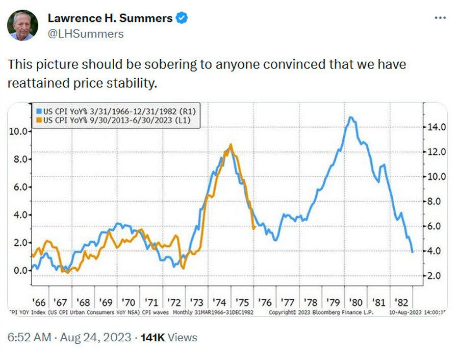
One thing to watch out for is the dreaded dual-axis chart. Sometimes these are unavoidable — if you’re trying to compare two things that are in different units on the same graph, you really don’t have much of a choice. But it pretty much always makes a chart more difficult to read, because it makes you figure out two y-axis, and because it can be easy to miss the second axis because it’s on the right. It’s also pretty easy to abuse, because you can stretch and compress your axis until you make things look like they line up more than they really do. For example, Larry Summers justifiably took a lot of flak for making a dual-axis chart that lined up 1970s inflation with 2020s inflation, even though the 70s inflation was a lot higher:
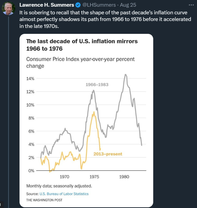
Summers later wrote a Washington Post op-ed with a chart that plotted the two inflations on the same y-axis. It made a similar point, but much less strikingly. The 1960s don’t really line up with the 2010s in terms of inflation, and the 2020s peak is much lower:
A dual-axis chart also allows you to shift two lines closer together, like the Financial Times did here:
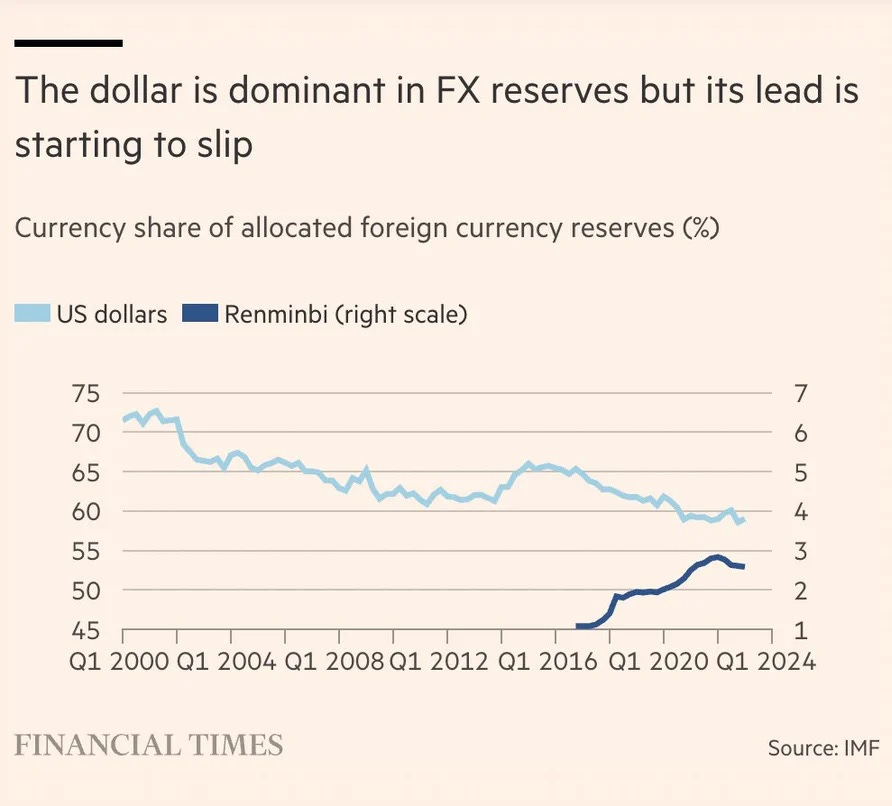
This makes it look as if the RMB is about to pass the dollar as a share of global reserves, when in fact it’s 60% to 3%. The later separated the lines into two panels when a bunch of people got annoyed at the dual axes on the original chart, but it’s not much better than before. Examples of this kind of visual illusion are sadly fairly common.
Another thing you should look out for is where the y-axis starts. Contrary to what some people say, it’s fine to have charts where the y-axis doesn’t start at zero. For example, if you’re graphing a human being’s body temperature, there’s no need to start at zero, because someone would be dead if their body temperature went to 85. Fluctuations of just a degree or two make a big difference in human body temperature, so you want to be able to zoom in and see those fluctuations.
That said, you should pay attention to where the y-axis starts. Don’t just assume it starts at zero! For example, combining a dual axis with one truncated y-axis is how Tyler Vigen made his famous joke about pool drownings vs. Nicholas Cage movies:

(Then again, this is Nicholas Cage we’re talking about, so you never know…)
Also, make sure you understand what’s happening with the units on the y-axis (and the x-axis). Here was a chart from Fox News that appeared in April 2020:

As you can see, the intervals on the y-axis are sized haphazardly, making this graph basically unreadable. Sometimes charts will do this and put a little squiggle on the y-axis to let you know they did it, but it’s still hard to see unless you pay close attention.
Some graphs also have a nonlinear scale. This is often fine, but when you stack two things on top of each other on a graph where the scale isn’t linear, the results can be hilarious. So pay close attention to the scale of the y-axis.
And there’s this famous example where the makers of the graph just…turned it upside down…
Now, I’ve been mostly focusing on the y-axis, but sometimes x-axes can be deceptive as well. It’s always worth a glance to see whether someone is trying to make an argument about 2023 with a chart that ends in 2009.
Finally, in addition to the axes, another thing to keep an eye on is whether the chart is missing some data. For example, sometimes people make graphs with different endpoints, and this can be hard to spot. I’m going to pick on my friend John Burn-Murdoch of the Financial Times, who is usually one of the econ blogosphere’s most excellent viral chart-makers, and whose charts I often repost. In my opinion he did slightly goof on this one:
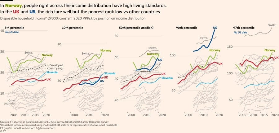
Note that the series for U.S. income ends a year earlier than the other countries; it omits 2020, a year when lots of countries gave out huge amounts of money to their citizens during the pandemic. The U.S. gave more than almost anybody, and disposable income jumped up by a large amount. But this chart only shows 2020 for European countries, because the U.S. data for 2020 wasn’t available yet. Therefore if you don’t look very very closely at this chart, it ends up looking like U.S. median income was lagging behind countries like Norway by 2020, when in fact it was not.
Now, realize that Burn-Murdoch’s graph, unlike the income-vs.-housing graph at the start of this post, isn’t misinformation. Nor is it meaningless made-up data like the Oxfam graph. Nor are the axes misleading. As far as I can tell, there are no mistakes or ambiguities in the data Burn-Murdoch is using; there’s just one key data point missing that changes the visual story that the graph tells. (I also wish the chart would have included more percentiles from the middle of the distribution, instead of the 5th and 95th percentile for which U.S. data wasn’t even available.)
Anyway, the moral of the story here is that it often helps to check the little details.
Putting it all together
In July of 2018, an impetuous young(ish) Bloomberg writer named Noah Smith posted the following chart in a column about Trump’s tax reform, showing real wages dropping by almost 2% in the second quarter of 2018:
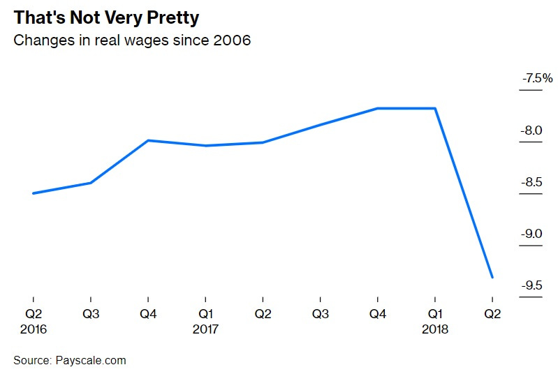
Yes, this chart is complete B.S. — easily the worst chart I’ve ever posted. And it went viral, getting shared by prominent Democratic politicians like Nancy Pelosi, before being debunked. Yes, my friends, I was a vector of viral misinformation. (I wrote a follow-up post apologizing for the bad chart and explaining why I had included it — government numbers for the second quarter weren’t out yet, and a bunch of people on Twitter were posting the Payscale numbers, so I just followed the herd and included that data in my column without exercising independent thought. Bad!)
So let’s see how we could have used the techniques in this post to see that my chart above was B.S.
First, let’s do some sanity checks. The graph claims to show a 1.8% drop in real wages from one quarter to another. That’s about a 7% annualized drop, which, if you look at the government data, is practically unheard of:

So right off the bat, this number is way too big to be real.
Next, let’s look at what the graph claims to be measuring. The y-axis isn’t the level of real wages — it’s the percent change in real wages since 2006. That’s confusing, because it means that when we look at a one-quarter drop, we’re looking at a change in a percent change relative to a year that isn’t even on the graph itself. You have to stare at the graph for a while in order to realize that the big drop at the end roughly equates to a 1.8% quarter-on-quarter drop in real wages. The difficulty of figuring out what this graph even means should be another red flag.
A third red flag is that the numbers on the y-axis are negative. That means that PayScale’s salary data showed real wages being lower in 2018 than in 2006! But anyone with even a passing familiarity with government data would know that real wages were actually higher in 2018 compared to 2006 (by about 7%, actually). So that’s another reason the PayScale wage data should have been instantly suspicious.
It turns out that the PayScale wage data was just complete crap — it regularly exhibited wild swings that had no relation to the actual data, and it presented a picture of national wages that was much more negative than reality. PayScale tried to defend their data, but it was hopeless. They’ve revised their methodology since then to be much less volatile, but I still wouldn’t use it — or any wage data from a private website.
But the point here is that B.S. charts are actually pretty easy to spot, if you just pay attention and exercise a little independent thought — which I definitely did not, back in 2018. I would like to think I’ve learned my lesson since then.
Spotting B.S. charts is easy; spotting misleading narratives is hard
Anyway, this has been a fun exercise in spotting charts that are egregiously bad. Things like false claims of inflation adjustment, mislabeled data, made-up measurements, goofy y-axes, and disreputable data sources are actually pretty easy to spot, if you take a minute and resist the initial urge to mash the share button. Not being fooled is a good way to get a warm sense of pride.
But in fact, charts that are total B.S. are much less dangerous than charts whose data is basically correct, but which get attached to misleading narratives. B.S. charts invariably get debunked in short order, whether by Community Notes or Politifact or Reddit or just by blogs like this one. But the misleading narratives that get attached to many other viral charts can persist for years, worming their way into the minds of the public until they become indistinguishable from consensus reality. Spotting and picking apart those narratives is a much more difficult task than catching simple misinformation.
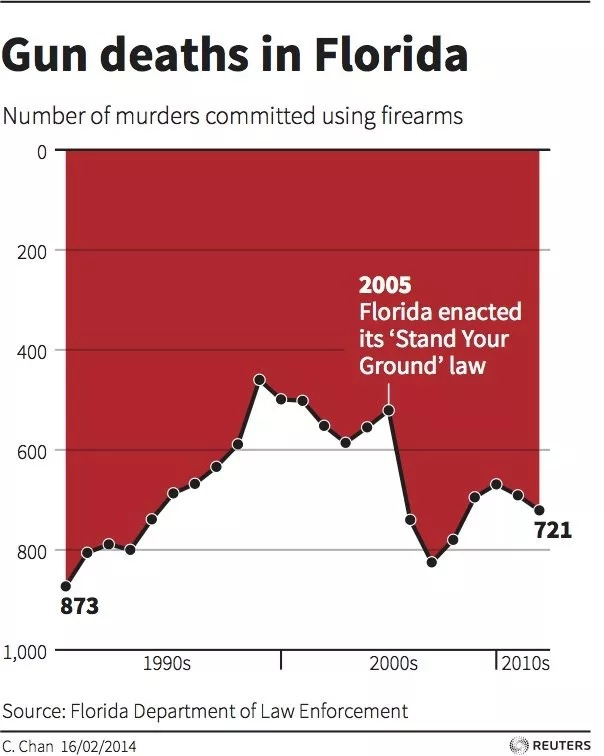
Part 2 of this guide will deal with how to avoid falling for those misleading narratives, by thinking carefully about the stories that viral charts appear to tell. And yes, we’re going to do this one:
Update: And, Part 2 is finally done! Enjoy!
How not to be fooled by viral charts, Part 2

It’s election season, so the viral charts are flying around fast and furious, as each side tries to support an economic narrative that will help their candidate win. In these trying, troubled, turbulent times, you’re basically on your own as an intelligent consumer of news. You can’t trust any single source — even me! — to be a complete unbiased explainer of economic trends and events. The best you can do is take in as much data as you have time for, and try to figure out what’s going on using your own faculties of logic and reason.
If the majority of us are watching short-form videos and looking at infographics or charts for 1.5 seconds per piece, I wonder about the nature of being fooled, getting it or being entertained in the process.
Apparent engagement online isn’t real engagement in that context. That’s one reason I like Substack where blogging isn’t dead and you can go deeper into a topic if you want to.
How about this one, from Vivek Ramswamy interviewed by Andrea Mitchell on MSNBC (not a chart, but still...):
https://www.google.com/search?client=safari&rls=en&q=Andrea+Mitchell%27s+interview+of+Vivek+Ramaswamy&ie=UTF-8&oe=UTF-8#fpstate=ive&vld=cid:4a9723eb,vid:uEs0H1NG-DM,st:0
Ramaswamy states, "The number of climate-disaster-related deaths is down by 98% over the last century."
Apart from whatever number he is using and whatever his source, the population of the world is four times higher today than a century ago. If the incidence of "climate-disaster-related deaths" was 2% then and 2% now, by the raw numbers, that's a 75% decline.