
How not to be fooled by viral charts, Part 2
When good data gets attached to a misleading narrative.

It’s election season, so the viral charts are flying around fast and furious, as each side tries to support an economic narrative that will help their candidate win. In these trying, troubled, turbulent times, you’re basically on your own as an intelligent consumer of news. You can’t trust any single source — even me! — to be a complete unbiased explainer of economic trends and events. The best you can do is take in as much data as you have time for, and try to figure out what’s going on using your own faculties of logic and reason.
But even though I can’t be your single perfect information source, I can try to help you hone your skepticism and recognize when the narrative you’re being fed doesn’t hold up. Last September, I wrote a post about how to spot misleading viral charts:

In the examples I gave — which included a chart I posted back in my Bloomberg days! — the data in the chart was either incorrect, or had been presented in a misleading way. But there are also plenty of charts where the underlying data is (probably) solid, and where the presentation of the data isn’t obviously bad, but where the narrative that people attach to the chart isn’t the story the data is really telling.
That’s the subject of Part 2 of my guide to How Not to Be Fooled by Viral Charts. I’m going to illustrate what I mean by examining four charts that were very popular and influential in the economic debates of the late 2010s:
The American Enterprise Institute’s “chart of the century”
The Economic Policy Institute’s “productivity vs. pay” chart
Lakner & Milanovic’s “elephant graph”
Lee Drutman’s “political compass” chart
But first, just a quick example of what I’m talking about. The other day, Taylor Nicole Rogers and Eva Xiao wrote a story in the Financial Times about how immigrants are helping to sustain the U.S. labor force in the face of the baby boom retirement. They illustrated this with a chart:
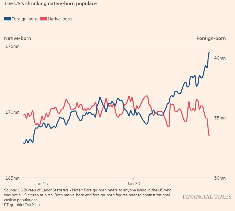
Now, this chart has some big problems — it uses a double y-axis and a truncated y-axis, making the recent changes seem much bigger than they actually are, and also making it easy to casually misread the chart and think there are more immigrants than native-born Americans in the U.S. workforce today. The x-axis also doesn’t include the years, which of course it should. Those are the kind of issues I talked about in Part 1. But on top of those issues, a lot of right-wing people misinterpreted the story this chart was telling. Instead of a story about the Baby Boom retirement, they interpreted it as a story about immigrants taking jobs away from native-born Americans:
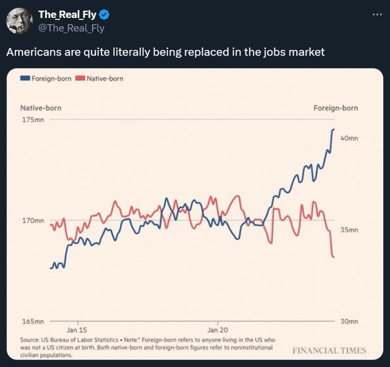
In fact, employment rates for prime-age native-born Americans are higher than at any point this century — even higher than in the Trump years. What’s really going on here is that the total number of older native-born workers in the U.S. economy is shrinking as the Baby Boomers and older Gen Xers retire early:

In other words, a chart about the Baby Boom retirement was misinterpreted — in this case, intentionally, and for political reasons — as a chart about immigrants taking jobs. The data wasn’t bad, but the narrative was wrong.
Anyway, let’s get to our four famous examples from the 2010s.
Example 1: The “chart of the century”
Inflation in America was generally low and stable between 1992 and 2020. But that low overall inflation rate masked significant changes in the prices of individual goods and services — some things got a lot more expensive, while other things got a lot cheaper. In a chart often called the “chart of the century”, Mark Perry and some other folks at the American Enterprise Institute illustrated some of these diverging price changes. Health care, education, and child care all got a lot more expensive, while cars, clothing, furniture, electronics, cell phone services, and software all got cheaper. Housing and food were somewhere in the middle. Perry (who is now retired) recently made an updated version of the chart, shifting the starting point and the endpoint a bit, but the graph looks basically the same, so I’ll use this new version:
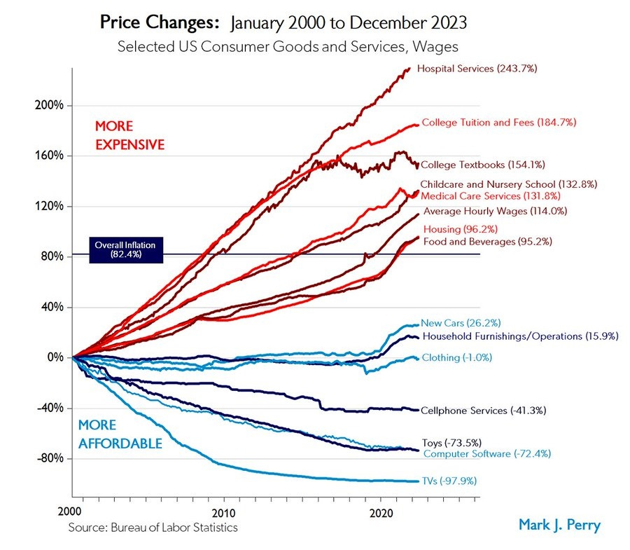
There’s no problem with the underlying data here — it comes from the Bureau of Labor Statistics. The BLS doesn’t always get everything perfectly right — no one does — but they do their very best, and they have lots of smart people working tirelessly to make this data as accurate as can be.
I do have two small problems with the way this chart presents the data. First, the college tuition number is the headline number, and doesn’t include financial aid. The price that students actually pay for college has increased much more slowly than the official sticker price, and didn’t increase at all after 2006. Second, Perry’s choice of labeling housing and food in red because they’ve gone up slightly faster than the overall rate of inflation is a little dubious here — both increased more slowly than wages, so they became more affordable over this time period, not less.
But these are minor problems. Overall this is a good chart with good data, and it illustrates a clear and important fact about the U.S. economy in recent decades: Physical goods have generally been getting cheaper, while services have generally been getting more expensive.
Many people who see this chart, however, come away believing that it reveals the root cause of service price increases. They think it’s all about government involvement and regulation:


And so on.
This is not Perry’s fault. He suggested this as only one possible interpretation when he posted the original chart back in 2018:
See any patterns? Tradeables (with import competition like TVs) vs. non-tradeables (like childcare), manufactured goods (with import competition like clothing and cars) vs. services (medical, hospitals, education), competitive (software) vs. protected industries (healthcare), degree of government involvement/funding/regulation?
But the “degree of government involvement” explanation seems to be a lot more popular than the “tradable vs. nontradable” and “manufacturing vs. services” explanations, despite the latter being perfectly plausible explanations for many of these trends.
In fact, when we look closely at this chart, we can see lots of discrepancies with the “degree of government involvement” narrative.
College textbooks are not highly regulated, and yet their price went up enormously — at least up until the mid-2010s. Textbooks are indirectly subsidized by cheap student loans, but their price actually stopped going up shortly after the time the government took over the student loan market from the private sector in 2009-2012.
Cell phone services are highly regulated, and yet their prices went down in the chart. Housing, meanwhile, is probably the single most regulated industry in existence, and is also subsidized by the government through tax breaks and vouchers, yet its price increased by less than wages over the given time period.
As for college tuition, private schools have much higher tuition than public schools, and their sticker price has increased by much more in total dollar terms since the 90s.
In fact, the popular notion that services are expensive because of a combination of regulation and subsidies doesn’t really work as an umbrella explanation. As I wrote in a post last year, subsidies are part of the story in some cases, and regulation is part of the story in some cases, but there’s a ton of nuance and heterogeneity here:

The “government involvement” story also doesn’t explain why many of the services that got less affordable from the late 90s through the early 2010s have been getting more affordable over the past decade:

So while government involvement almost certainly plays a role in some of the price differences in the “chart of the century”, it’s probably just one of many factors. Taking the chart as proof of a simple “libertarians are right” narrative, as many people do, is a mistake.
If there’s an overarching lesson here, it’s that when a chart shows a lot of different trends, you should expect these trends to have several different causes. Rarely is there “one economic theory to rule them all”, and if you think a chart has demonstrated the existence of such a theory, there’s a good chance you misinterpreted the chart.
Example 2: Productivity vs. pay
Perhaps no single chart has been as influential in the American discourse over the past decade as the “productivity vs. pay” graph. There are many versions of this graph floating around, but I’m going to use the versions published by the Economic Policy Institute. Here is probably the most famous version of the chart — the version that most of us used when we debated the issue back in the late 2010s:
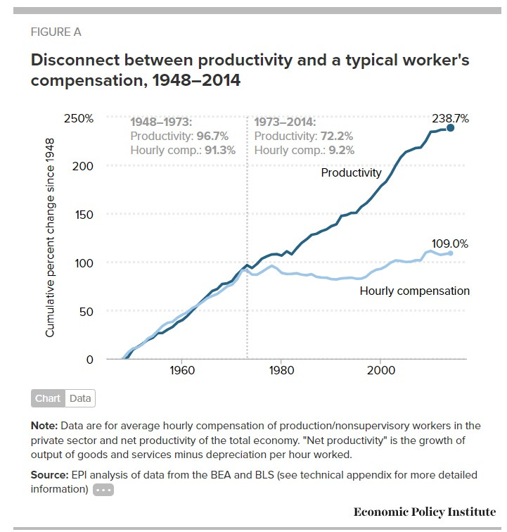
In fact, there was a major problem with the way this chart was made, which EPI has since corrected! Although it’s not made explicit on the chart, the two series are calculated using different inflation measures. Productivity is calculated using the GDP deflator, while wages are calculated using the consumer price index. The former has gone up a lot less than the latter. If you really want to compare apples to oranges, you need to use the same measure of inflation. So in recent years, EPI has started publishing new versions of the chart where both lines use CPI inflation:
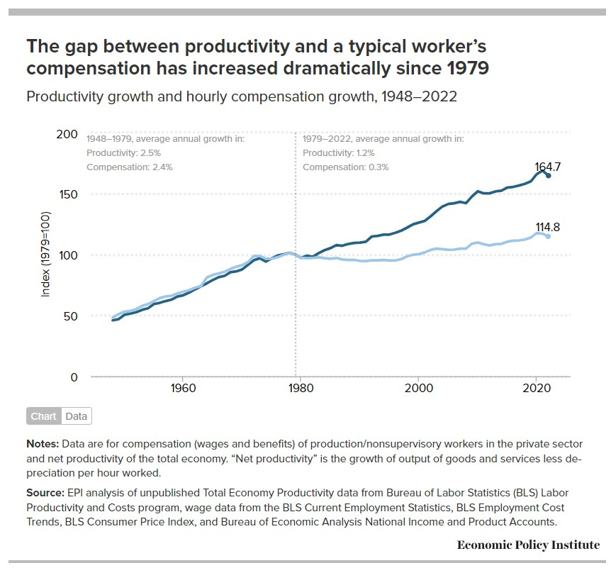
This is a much less dramatic divergence, but it’s still significant.
Now again, this data is just from the BLS, so it’s the best data we’ve got. No complaints there. And after EPI put in the inflation adjustment, there’s nothing that’s really misleading about this chart. (There were some earlier versions of the chart by other think tanks that had other problems, but EPI avoided these.)
But what about the narrative attached to this chart? Here things get dicey. A lot of people look at this chart and simply think “Hmm, workers aren’t getting paid enough, they deserve to be paid more.” And maybe that’s true. But why does a comparison with productivity demonstrate that fact?
The reason comes from economic theory. There’s a very simple theory of wages that says that workers’ compensation should equal the marginal product of labor.1 If you apply this simple theory to the chart, and if you assume that average productivity is close to marginal productivity,2 then the chart seems to suggest that workers aren’t getting paid what they’re “worth”. Which in turn suggests that corporations are managing to keep a larger and larger share of the economic pie for themselves. Elizabeth Warren, for example, uses the EPI chart to tell exactly this story:
Over the past few decades, fundamental changes in our economy have left millions of working families hanging on by their fingernails. Wages have largely stagnated even as corporate profits have soared and worker productivity has risen steadily. The share of national income that goes to labor has declined and is near its lowest point in almost 70 years.
These trends reflect a shift of trillions of dollars away from the pockets of working families. And they are all driven by a single underlying problem: American workers don’t have enough power.
Now, it is true that labor’s share of national income has fallen since the early 1970s. But it’s also true that the drop is much too small to explain the divergence between pay and productivity on EPI’s chart.
Take another look at EPI’s chart. Note that the title says “a typical worker’s compensation”. And if you read the fine print, you’ll see that the compensation on the graph is only for production/nonsupervisory workers. In other words, the EPI chart leaves out compensation for managers, many professional workers, and so on. It also doesn’t include self-employed workers, who presumably put in some labor as well. In other words, the chart shows productivity for the whole economy, but only shows pay for one subset of workers.
The simple Econ 101 theory of wages assumes there’s only one type of worker. But if you modify it to include two different types of workers, with two different productivity levels, you will end up with two different wage levels. And if you try to match the wages of one type of workers with the productivity of both types of workers combined, you will see a difference there. And this difference can increase over time, if the productivities of the two types of workers diverges over time.
What happens if you include all workers in the pay numbers? The lines get a lot closer together. John Van Reenen has a good post showing how the graph changes if you look at median compensation (which is pretty close to the production/nonsupervisory number on the EPI chart) vs. average compensation (which includes all workers):
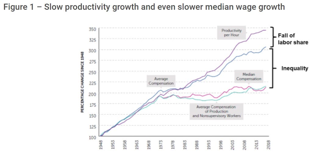
Inequality — the difference between median and mean compensation — is more than twice as important as the fall in the labor share.
In fact, EPI also has their own breakdown showing how much of the productivity-pay divergence in their chart is due to inequality, vs. the fall in the labor share:
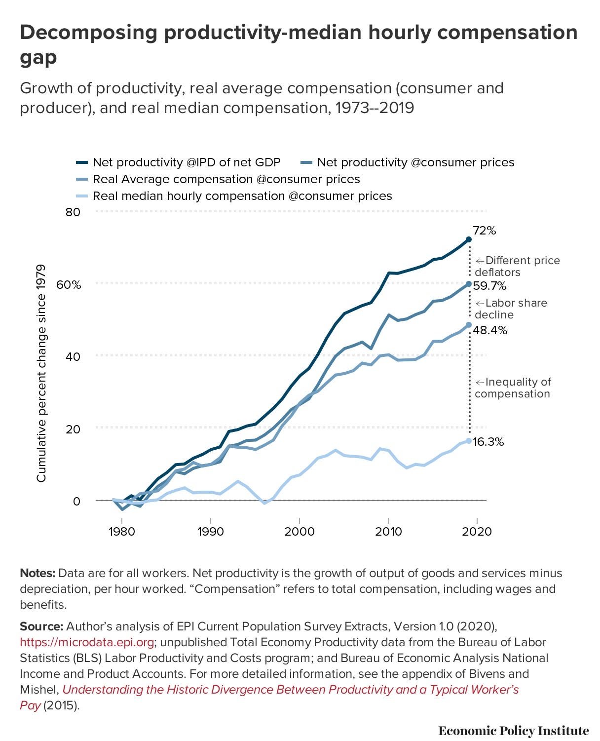
In this chart, the rise in wage inequality between workers is about three times as important as the fall in the labor share.
In other words, the EPI chart is mostly not a chart about corporations keeping money away from workers. It’s mostly a chart of some workers getting paid a lot more than others. It’s a chart of wage inequality.
Why have some workers seen their pay rise a lot, while others have seen their pay rise only a little? We don’t actually know. Maybe managers and professional workers have more negotiating power within corporations than lower-level workers do. Maybe top-level workers have gotten a lot more productive thanks to the rise of information technology and knowledge industries, while the typical worker has gotten less productive due to the decline of manufacturing.
But whatever the reason, the story here is mostly not a story about capital vs. labor. It’s a story about high-paid labor vs. low-paid labor.
Now, it’s also true that the labor share of income has been decreasing, and that this is a modest part of the divergence on the graph. But by combining the rise in wage inequality and the labor share decline into one single “productivity-pay divergence”, EPI has combined these two narratives into one single number. And it doesn’t seem like they ought to be combined. Maybe they’re related in some way, but maybe not.
So while there’s nothing wrong with EPI’s data — productivity and nonsupervisory workers’ pay have indeed diverged — I don’t think this is a very illuminating way of presenting the facts.3 Instead, I think it would make more sense to simply show two different charts:
a chart showing rising wage inequality, and
a chart showing the falling labor share.
Showing these two charts wouldn’t mean that we have any less concern for the average worker. But it would allow us to see that there are probably several different things hurting the average worker, instead of just one thing.
The lesson here is that our interpretation of a chart depends heavily on theory. So you have to look very closely at a chart in order to tell what theory we should be applying to try to understand it.
Example 3: The “elephant graph”
In the late 2010s, people in rich countries reconsidered globalization. This was partly a reaction to Trump’s victory in 2016, which was widely perceived as a revolt by left-behind manufacturing workers. Plenty of research was coming out at the time showing that the China Shock had damaged a large section of the American workforce, and that inequality was increasing within developed countries. It wasn’t hard to put two and two together and conclude that globalization had helped the world’s poor at the expense of the poor and middle class in countries like the U.S.
In fact that story might be true. But then in 2015, Christopher Lakner and Branko Milanovic came out with a chart seeming to demonstrate this story in dramatic fashion. It was called the “elephant curve”:
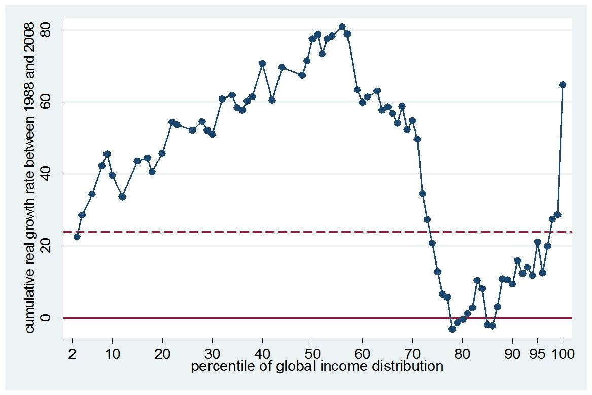
This graph shows that between 1988 and 2008 — the peak years of globalization, including the China Shock of the early 2000s — the income of the middle percentiles of the global income distribution grew strongly, but stagnated or even fell for the 75th-85th percentile.
A ton of people, including news outlets and even some economists, immediately identified the “trough” of the elephant graph as the rich-world middle class. Here’s what Luke Kawa wrote about the chart for Bloomberg back in 2016:
Globalization constituted a massive labor supply shock, allowing corporations to tap cheaper workers. The benefit to consumers in advanced economies took the form of downward price pressures on these goods. Along the way, however, the middle classes in developed nations failed to see this rising tide lift their boats.
"The biggest losers (other than the very poorest 5 percent), or at least the 'non-winners,' of globalization were those between the 75th and 90th percentiles of the global income distribution whose real income gains were essentially nil," according to Milanovic. "These people, who may be called a global upper-middle class, include many from former Communist countries and Latin America, as well as those citizens of rich countries whose incomes stagnated."…
This chart is now making the rounds on Wall Street as strategists search for an economic rationalization of the British referendum vote, the success of U.S. populists, and the rise of separatist movements in Europe, many of which are isolationist in nature.
But note what Milanovic himself says about the chart! He identifies the losers primarily as people in the Soviet Union and Latin America. He also mentions “those citizens of rich countries whose incomes stagnated”, but doesn’t specify that those citizens were the middle or working classes.
In fact, it turns out that the American middle and working classes are quite a bit richer than you might think. 60% of the U.S. population falls into the top 5% of the global income distribution. Only very poor Americans are in the 75th-85th percentiles of the global distribution, where Lakner & Milanovic’s chart shows income stagnating or falling.
And there are not many very poor Americans — or very poor Europeans, for that matter. Which means most of the people in the trough of the elephant graph were living in the Soviet Union, Latin America, and other upper-middle-income countries. Homi Kharas and Brina Seidel took a close look at the data and confirmed this:
[I]n the original elephant chart, just 36 percent of the population that falls in the very bottom of the trough 80th-84th ventile in 1988—which has been literally highlighted [in the media] as Trump’s base—is from the U.S., Canada, or Western Europe. In fact, none of that population is from the U.S.; the U.S. middle class is actually in the 90th through 99th percentile of the global distribution. Our work corroborates the findings of others that this group gained relatively little over the past two decades. Instead, the trough of the original chart contains large populations from Japan, Eastern Europe, and Latin America. Japan’s lost decade and the collapse of the Soviet Union are largely responsible for the slow growth of this cohort.
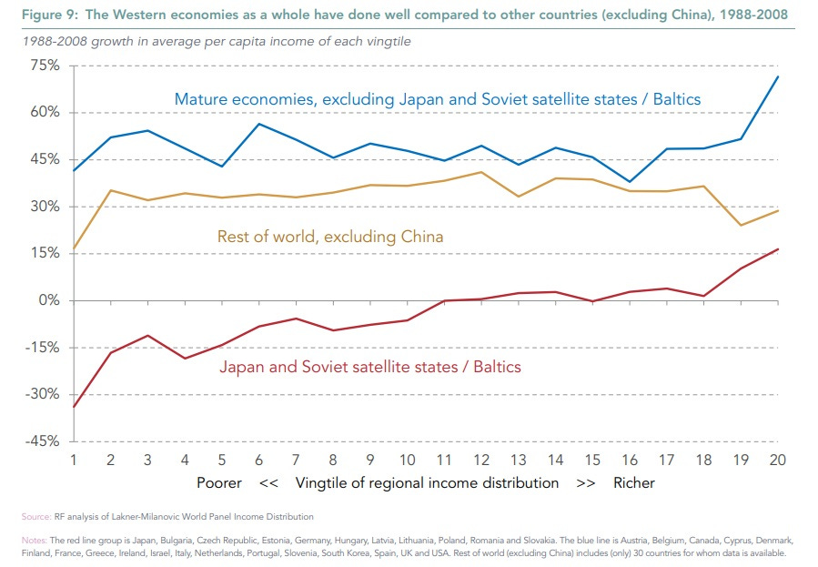
Adam Corlett did his own close examination of the data and found the same thing, noting that the middle and lower classes in the developed world — except for Japan — actually did pretty well from 1988 to 2008, even if they didn’t do quite as well as the rich:
The widespread misinterpretation of the elephant graph is not — at least, as far as I can tell — the fault of Lakner and Milanovic. Milanovic has spent much of his career lamenting the fall of the Soviet Union, so of course this was going to loom large in his thinking. And in their paper, Lakner and Milanovic show that the big hit to the upper-middle percentiles of the “elephant” was concentrated in the years 1988 to 1993 — not a particularly bad time for inequality in the West, and long before the China Shock, but exactly coincident with the fall of the USSR and the economic crash in Japan.
But the Western world looked at the elephant chart and saw what they wanted to see — proof that globalization had uplifted the world’s poor only at the expense of hollowing out the developed world’s middle class, resulting in the backlash of Trump and Brexit. The chart went viral because it fit the political narrative of the moment.
Anyway, as it happens, there are lots of other problems with the elephant graph. Chief among these is the fact that the graph measures changes in income at each point in the distribution, rather than changes in income for people that start out at each point in the distribution. Those are very different things. The rich world experienced decent income growth but slower population growth than the rest of the world, meaning that they got squeezed into a smaller and higher level of the distribution. When you redo the elephant graph while holding people’s starting point in the distribution constant, it doesn’t look like an elephant at all — global income growth was a lot more evenly distributed than Lakner & Milanovic find. This is probably one reason why you don’t see a lot of economists talking about the elephant graph anymore.
But anyway, the case of the elephant graph shows another big pitfall when interpreting viral charts: the instinct to fit charts to a desired political narrative.
Example 4: The “political compass” chart
Speaking of political narratives, let’s talk about a political science chart.
In the aftermath of the 2016 election, a lot of thought and energy went into analyzing why Trump won. The Democracy Fund launched a very large in-depth survey of thousands of Americans, called the VOTER (Views Of The Electorate Research) Survey. That acronym isn’t particularly optimized for search engines, which are not case sensitive. But the survey itself seems pretty good — carefully conducted, large sample size, and so on.
Lee Drutman had a good writeup of some of the survey’s findings. His most famous finding, by far, was this chart:
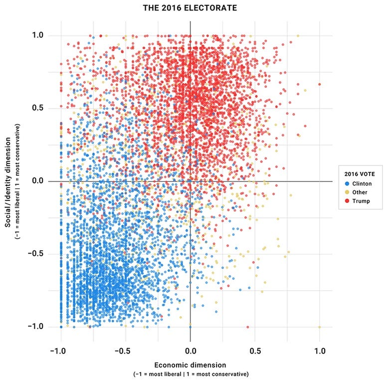
The chart appears to show a big empty space in the American political spectrum — the lower left quadrant. This quadrant represents people who are conservative on economic issues but liberal on social issues — basically, your classic libertarians.
The fact that this quadrant is mostly empty told many pundits that libertarians — or people who call themselves “socially liberal but fiscally conservative” — are basically nonexistent among the American electorate. For example, center-left pundit Jonathan Chait wrote:
Libertarians don’t exist…Well, obviously, they exist — just not in any remotely large enough numbers to form a constituency. It’s not just hard-core libertarians who are absent. Even vaguely libertarian-ish voters are functionally nonexistent…The fourth quadrant, socially liberal/economically conservative, is empty…
The libertarian movement has a lot of money and hard-core activist and intellectual support, which allows it to punch way above its weight. Libertarian organs like Reason regularly churn out polemics and studies designed to show that libertarianism is a huge new trend and the wave of the future. Sometimes, mainstream news organizations buy what they’re selling. But the truth is that the underrepresented cohort in American politics is the opposite of libertarians: people with right-wing social views who support big government on the economy.
The implication, then, is that Democrats should focus on winning over voters in the upper left quadrant — people who are socially conservative but like big government — by trumpeting their bread-and-butter issues and toning down the wokeness. This is basically what David Shor or John Fetterman might recommend.
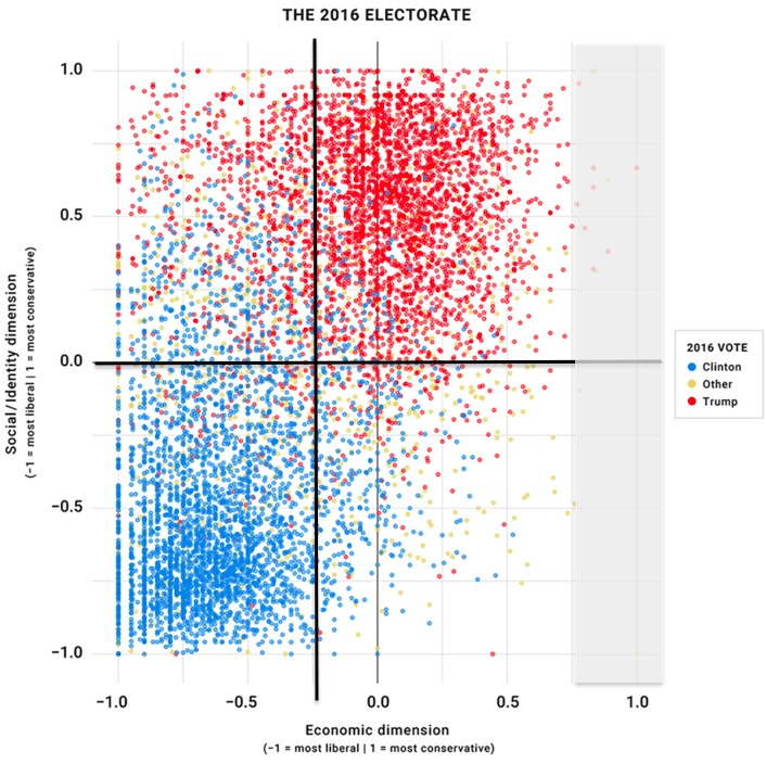
But while that might be a good strategy, it’s questionable whether Drutman’s chart really shows that. In a post for the Niskanen Center, Karl Smith showed that the conclusion is heavily sensitive to where you draw the edges of the chart:
[T]he more I stared, the stranger this chart seemed. It’s not just that the bottom right quadrant is empty. The dots along the top and left ends of the charts are smashed together. They don’t fade out gradually as data typically do. There is actually more mass up against the top and left wall than in the other quadrants. That pattern suggests the data have been significantly truncated. That is, some folks would have scored greater than 1 on social conservatism and many folks would have scored less than -1 on economic liberalism. However, the scoring procedure didn’t allow for that. Instead, it truncated these voters to the maximum allowable scores of 1 and -1, respectively.
Now, what that suggests is that 0.0 on this graph is not only the false center of mass, it’s also not the center of the range of opinion…It appears that the questions were scored such that the extreme far right wing takes were marked as +1, whereas relatively center-left takes were marked as a -1.
Smith tries moving the axes a little bit to the liberal end of the “identity issues” scale, and finds that the distribution looks much more symmetric:
There’s still a bit of lopsidedness, but most of the polarization is now along the diagonal — between people who are both socially and economically liberal, and people who are both socially and economically conservative.
Now, it might be true that the American electorate is just very progressive on social issues, so moving the axes the way Smith did is just tampering with the data. But it’s worth noting that other surveys find a much more symmetrical distribution. For example, in 2015 Nate Silver looked at the General Social Survey — a large and frequently repeated in-depth survey — and found that if you use income redistribution as a proxy for economic values, and gay marriage as a proxy for social values, the distribution in 2010-12 looked pretty evenly divided between “libertarians” and “hardhats”:
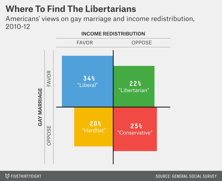
In other words, this looks like another case where a viral chart got attached to a particular political narrative that people wanted to believe. In fact, that narrative is not that different from the one that made the elephant graph go viral — a desire for Democrats to appeal to the “hard hat” types.
Whether that narrative is right or not, of course, is another question entirely.
Narratives are harder than data
In general, there are three reasons why a viral chart might lead you astray:
The data might be bad.
The data might be presented in a misleading way.
You might interpret the data to support a narrative that the data doesn’t support.
The third of these is the hardest to catch. You are human, and humans are not truth-seeking machines. There are plenty of other things besides truth that we want from our data. We want to feel that we understand the world. We want to feel like a bunch of our fellow humans agree with us. We want to feel like what’s good for the world is also what’s good for our own pocketbooks and social status. And so on.
That’s why spotting the problems with viral charts — or the popular narratives attached to those charts — can be such disheartening, thankless work. It would be very nice if the world were as simple as the economic stories that prevailed in the U.S. in the 2010s. But it isn’t that simple, and it never was. Struggling with the complexities might be painful, but that’s what will give us the power to reshape the world more effectively in the 2020s and beyond.
In fact, it says that workers’ compensation should equal the marginal revenue product of labor, which is a little different than the marginal product of labor. Those are generally not equal.
If companies have hired too many workers, then marginal productivity will be lower than average productivity, meaning the economically efficient move is for companies to fire workers until productivity goes up.
Some of the people who have tried to debunk the EPI chart show charts where pay and productivity line up perfectly. But in order to get this result, they have to make other dubious changes — for example, leaving the entire finance industry out of the chart.
The political compass one should read “lower _right_ quadrant” fyi.
The EPI chart showing productivity Notes, says "less depreciation".
A couple of things.
A. We distinguish between Variable Cost productivity (direct materials, Unit labor) from Capital (asset, investment),productivity.
B. Less depreciation would diminish Capex productivity, which improves a factory or lines output efficiency. Like an Investment in more efficient heat transfer, or 20% capacity increase at 5% of initial $Rev/$capex^1.
Additionally, businesses don't capitalize all assets and all capital productivity. They take it as a current period expense. The auto industry would capitalize and depreciate the infrastructure of an auto plant. But they would current period expense Tooling. A few billion in fact.
Great lessons on being a CharSkeptic <<< available freely to use