What's up with those revised job numbers?
Government data revisions can be scary, but they actually aren't that hard to understand.

You may have noticed a scary-sounding story this week about jobs numbers. The Bureau of Labor Statistics revised its estimates of job growth for the last twelve months, and the new estimates are 818,000 lower than the earlier ones:
US job growth was probably far less robust in the year through March than previously reported…The number of workers on payrolls will likely be revised down by 818,000 for the 12 months through March — or around 68,000 less each month — according to the Bureau of Labor Statistics’ preliminary benchmark revision. It was the largest downward revision since 2009.
That sounds worrying for two reasons. First, does it mean the economy is getting worse? Are people’s jobs and wages in danger. And second, if the government can get the jobs numbers wrong by this much, does it mean we can’t trust government statistics? Might someone in the government even be manipulating the jobs numbers for political purposes?
Fortunately, you have me, your friendly neighborhood econ blogger, to explain what it all means.
First of all, I highly, highly doubt anyone in the government is faking the jobs numbers. This would be really hard to do, since it would involve a whole bunch of government workers acting in collusion, which would require a paper trail. But more importantly, there’s just no motive for doing that. Why would the Bureau of Labor Statistics publish deliberately fake numbers in March and then tell you the real ones in August? “Aww darn it! We tried to fake the numbers, and we almost got away with it, but our master plan was foiled by our own regularly scheduled revision process! CURSES!” That is not how things work.
So if it’s not a conspiracy, is it the result of gross incompetence? Probably not — the U.S. government statistical agencies are generally regarded as the best in the world, either in the public or the private sector. But getting accurate data in a country of 330 million people is a tough undertaking for even the best team. This year’s revisions are bigger than in recent years, but they’re hardly unprecedented:

OK, so this was really just a somewhat-larger-than-usual data fluke. How big of a deal is it, in economic terms?
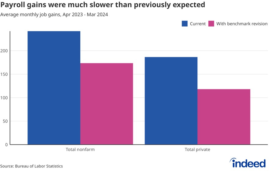
First of all, it doesn’t mean 818,000 Americans lost their jobs! Even with the revised numbers, the economy still added jobs overall between April 2023 and March 2024:

So if the purple number is the real number (and these do get revised again later), does that mean the economy is doing well or poorly? In fact, I’m not really sure it tells us a lot.
Why do we expect the economy to keep adding hundreds of thousands of jobs every month? Remember that that’s a net figure — it’s the number of new jobs created minus the number of old jobs lost. So if the economy adds 200,000 jobs in a month, that means there are 200,000 more jobs this moth compared to last month.
How can this keep on going forever? Eventually won’t everyone in the country have a job, meaning that there’s no more room for continued increases? Well, not entirely. America’s population is still growing, and new jobs have to be found for those newcomers. But in general, yes — as the economy gets closer to full employment, it gets a lot harder to keep posting those big jobs numbers every month. Eventually it becomes impossible.
The U.S. population is currently growing at around 145,000 per month, and the country’s age structure looks pretty stable. So the U.S. needs to add somewhere around 145,000 new jobs every month to keep up with population growth. If you look at the chart above, you’ll see that even after the new revisions, the U.S. is estimated to have added around 174,000 jobs a month from April 2023 to March 2024. In other words, the country is adding just about enough jobs to prevent the jobless population from growing.
And in fact, the jobless population doesn’t seem to be growing — at least, not by a lot.
So, here’s the part where I explain the two types of employment numbers. The U.S. government has three basic methods of determining how many people have jobs:
It calls up companies and asks “How many workers do you employ?”, and then tries to extrapolate from that. (This is called the Current Employment Statistics survey, or the “payroll survey”.)
It waits for states to report their unemployment insurance claims, and then tries to extrapolate from those. (This is where the revisions to the CES come from.)
It calls up households and says “Hey, do you have a job right now?”. (This is called the Current Population Survey, or the “household survey”.)1
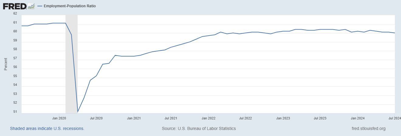
The payroll survey, or CES, is where the monthly “jobs numbers” come from. That’s what we’ve been talking about so far. But the unemployment rate — and also my favorite labor market indicator, the employment-population ratio or employment rate — comes from the household survey, or CPS. So if we’re not sure about the jobs numbers, we can check the employment numbers and see what they tell us.
And the employment numbers generally look pretty good. The employment rate has been falling a bit since March, but it’s still very high in historical terms:
Also, it’s important to remember that this employment rate includes old people, and the Baby Boomers have been retiring en masse. So it’s good to check the prime-age employment rate — the employment rate for people between age 25 and 54, who are unlikely to either be in school or have taken early retirement. This rate is just about as high as it’s ever been, and higher than it ever got in 2019:
Now, this number doesn’t tell us everything we want to know about labor markets — old people and young people matter too! But it’s a pretty reliable gauge of the health of the employment situation, and it’s looking pretty good right now.
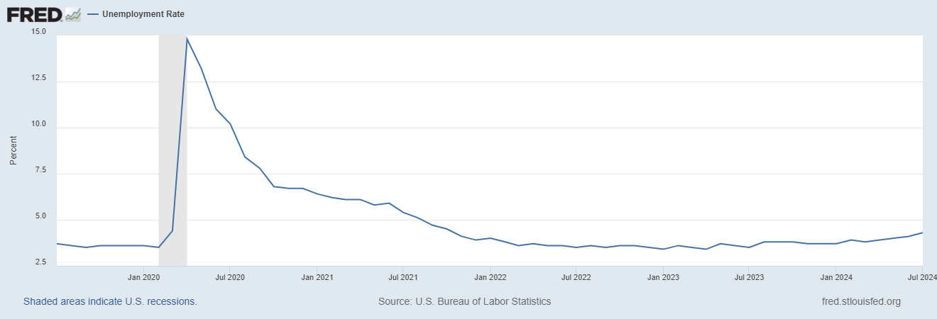
As for the unemployment rate, that’s looking a tiny bit more worrisome. Unemployment has inched up since the start of this year:
BUT, there’s something to always keep in mind when you look at this number. The unemployment rate is defined as the percent of people who are in the labor force but who don’t have jobs — i.e., who say they’re looking for a job but who can’t find one.
The employment rate is pretty unambiguous — everyone knows what it means to have a job. But what does it mean to be “unemployed” vs. “not in the labor force”? It’s entirely a matter of whether you say you’re looking for a job or not. So the unemployment rate can rise if people start saying “Now I’m looking for a job.”
In fact, this is part of the reason the unemployment rate has been rising this year! This is from Nick Bunker’s (always excellent) writeup:
On a three-month average basis, the unemployment rate has risen 0.55 percentage points since its low of 3.5% in January 2023. More than half of that increase (0.3 percentage points) has been driven by workers who report losing their jobs. But another 0.23 percentage points comes from new entrants or reentrants — people joining the labor force for the first time or coming back to it. It is generally less worrisome when unemployment is driven up because more workers are choosing to join the labor force because it suggests workers have some confidence they will find work and are actively seeking a job…
There’s additional evidence that workers are joining the labor force, albeit as part of the ranks of the unemployed. Workers in their prime working years (ages 25-to-54) who were out of the labor force have been entering unemployment at an increasing rate in recent months.
As Nick points out, it’s not a bad thing to have more jobless people looking for jobs!
So when we look at the numbers from the household survey, we get a picture of a labor market that’s pretty much static — almost all the people who want jobs have jobs, and that hasn’t changed much over the past year. This was basically the upshot of a post I wrote a couple of weeks ago, and this week’s revisions don’t change that story:
Now as I argue in that earlier post, the employment numbers are a little bit weaker than they had been, and it’s probably a good idea for the Fed to start cutting rates in order to get out ahead of any possible further bad news, especially since inflation seems to have subsided. This week’s revisions are consistent with that advice.
Also, as Dean Baker points out, the story from this week’s revisions isn’t actually all bad. Fewer jobs added, for the same amount of GDP growth, actually means faster productivity growth than we had previously believed — the economy did more with less. Faster productivity growth is great. It’s important for long-term living standards, it reinforces the techno-optimistic “Roaring 20s” narrative, and it gives the Fed more room to cut interest rates without exacerbating inflation.
But anyway, back to the jobs numbers. How did the U.S. government’s payroll survey get numbers that were off by 818,000?
Well, it turns out that estimating the total number of jobs in a nation of 330 million people, every month, is pretty hard! It requires a lot of statistical assumptions, and sometimes those assumptions fail harder than other times. For example, new companies get started up, and old companies die, and in general neither of these gets included in the payroll survey — the government doesn’t have the new companies in their database, and the dead companies don’t answer the phone. So the government has to estimate how the births and deaths of companies contribute to employment every month.
On top of that, some people change jobs during the survey period, or work multiple jobs. This can make job creation look higher than it is. And some workers work off the books, which can make job creation look lower than it is. The government tries to correct for these inaccuracies with statistics, of course, but their methods might over-correct or under-correct in any given month.
In the case of this month’s revisions, another likely culprit was illegal immigration. Bloomberg reports:
Because the QCEW report is based on unemployment insurance records — which undocumented immigrants can’t apply to — the data are likely to have stripped out up thousands of unauthorized workers that were included in the initial payroll estimates.
So the revisions could be undercounting, because they’re not including the jobs that were created for all the people flooding across the border back in 2023 before Biden cracked down. Of course, to conservatives, jobs provided to illegal immigrants might not be something worth celebrating. But pragmatically speaking, it’s better than having a bunch of undocumented folks sitting around with no work and nothing to do!
Given all of these statistical difficulties, it’s inevitable that preliminary data is going to have to be revised. Personally, I agree with Joe Weisenthal that the U.S. government, rather than being denounced for those revisions, should be commended for publicly correcting their statistical guesses in such a transparent, open, and systematic way:
Anyway, the upshot here is: If you see someone spreading doom and gloom over the recent job number revisions, don’t fall for it. The revisions don’t mean the economy is bad, or that a recession is coming. And they certainly don’t mean that the U.S. government is faking things. There is no conspiracy here, only statistical noise.
In fact, the payroll and household surveys measure slightly different things. The household survey includes some things like self-employment, which are left out of the payroll survey. For example, I, Noah Smith, would be counted as employed in the household survey, but my job wouldn’t appear in the payroll survey. For this reason, when comparing the two surveys, economists often adjust the definitions of “employment” to match each other.


You should take this more seriously. It was less than a year ago you were bemoaning how voters were believing "vibes" over data.
https://www.noahpinion.blog/p/vibes-vs-data
You described the mismatch between people's self-reported view of the economy and the claims of the Biden administration as merely due to "negative narratives" that "distorted people's understanding" and "entice us into believing things that aren't true". It was, you said, "asymmetric warfare".
There was another very obvious possibility at the time: that people's perceptions were correct and the US data was wrong. This scenario was so obvious that I raised it in your comments section:
"The other possibility is that the western economy is highly correlated and that the USA is actually doing more like Europe, but the US data has gone bad in some undetected way." and "Something big missing from the data is the usual kind of issue that causes divergence between people's overall impression and what they should be feeling."
https://www.noahpinion.blog/p/vibes-vs-data/comment/44699252
Now we have a huge revision in the numbers downwards. The "vibes" were apparently not so inaccurate after all. It would be reasonable to reflect on the fallibility of macroeconomics and governments vs the wisdom of the crowds.
Minor but important quibble. IF the US pop is growing at 145k/month and the age structure is stable, you need to add E/P*145k jobs to keep E/P stable (P is entire population not 16+ as in official stats) That's more like 70k/month