


At least five interesting things for the middle of your week (#8)
The geography of Bidenomics, the quiet VC bust, meritocracy hypocrisy, frying-pan graphs, and why mergers fail


I wanted to write about the room temperature superconductor thing, but I decided not to do so until we know a lot more than we currently do; most of what’s flying around is some combination of misunderstanding, misinfo, and fun internet hype. But there’s plenty of other interesting stuff going on in the world! I’ll probably have another roundup very soon, as I’m falling behind on all the stuff I wanted to write about.
Before I get to the list, here are some podcasts I’ve been on recently! First, episode 4 of my new Econ 102 podcast is a crossover with the Moment of Zen podcast, so Dan Romero is added as an extra host. Here’s a Spotify link:
Here are links to Apple Podcasts and YouTube, and here’s a link where you can subscribe to Econ 102 if you like!
I also recently appeared on the Curiosity Podcast, hosted by Immad Akhund and Rajat Suri. Here’s Spotify:
And here’s Apple Podcasts and YouTube.
Anyway, on to this week’s roundup!
1. The new geography of Bidenomics jobs
“Papa got a job with the TVA/ We bought a washing machine, and then a Chevrolet” — Alabama
People are starting to pay attention to the geographic aspect of the investment boom that’s resulting from the U.S.’ new industrial policy. Given all the hoopla about the Midwest after Trump’s breakthrough victory there in 2016, you’d think the investment would be concentrated there. But in fact, the South and West are getting more, and the South is getting an outsized share relative to GDP:
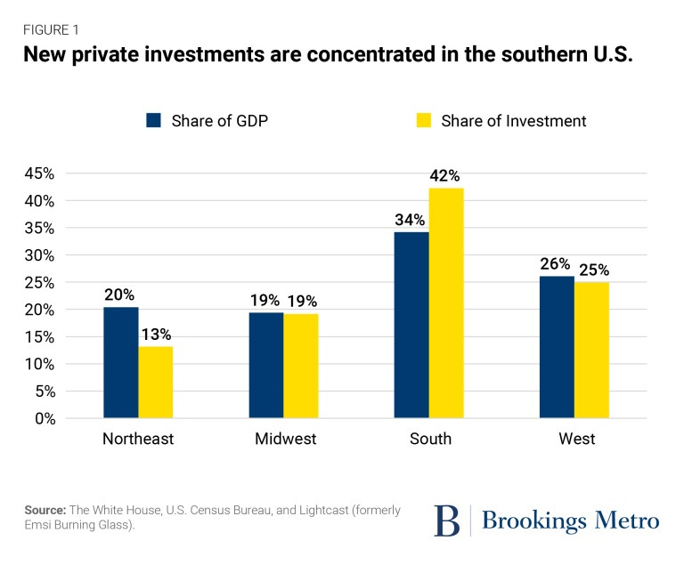
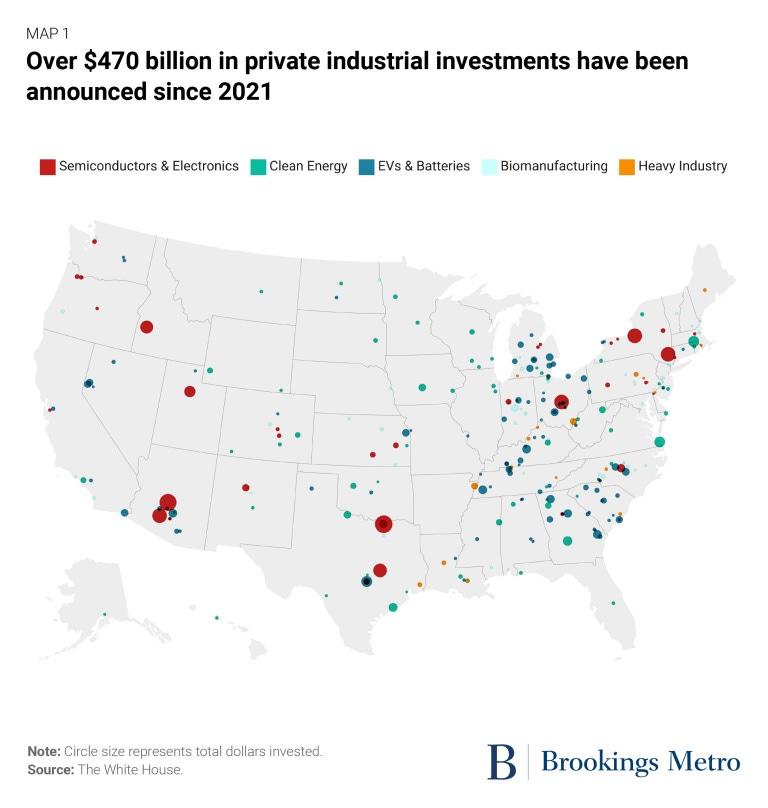
If you look at a map, very little of the investment is on the West Coast; what’s happening in the West is mostly in the interior states like Arizona, Idaho and Utah. The investment in the Northeast is mostly in upstate New York, with almost nothing in New England. Meanwhile the investments in the Midwest and South are spread out among a larger number of smaller towns:
Some progressive pundits are claiming this as a smart electoral strategy, because Arizona and Georgia are important swing states for 2024. Others are worried that the concentration of investment in states where labor unions are weaker will reduce the degree to which industrial policy supports union power. But to be honest, I think this map mostly just reflects costs rather than politics.
Remember that the biggest piece of what the CHIPS Act and the IRA do is to provide huge subsidies to private investors. Real government investment has ticked up, but isn’t booming yet:

The subsidies provided by these policies aren’t region-specific. So what we’re really seeing is where private companies would prefer to put factories. That’s going to be determined by a whole bunch of things like land acquisition costs, the availability of cheap housing, weather, the education level of the workforce, labor regulation, and so on. It’s also going to depend on local clustering effects — California has Silicon Valley, so it’s probably hard to pull top tech workers away from their lofty tech salaries to go work in a chip fab.
As for the South, I wouldn’t leap to assume that it’s union-unfriendly policies that are driving the disproportionate share of investment there compared to the Midwest. The South doesn’t have much of a wage advantage at all here — average annual pay in Georgia and Tennessee is about the same as in Wisconsin and Michigan. Instead, my intuition is that the South’s advantage is probably due to some combination of weather and the ease of building new buildings — which is why Americans are also moving there in general.
But the real message here is that we shouldn’t just look at a map of investment and assume that it reflects a place-based regional development strategy or electoral politicking by the Biden administration. States in the West and New England need to think about why it’s hard to build factories there.
2. The “frying pan charts” are just charts of inflation
On Twitter, economist Alex Williams has caused quite a stir by showing a bunch of “frying pan” graphs. After the financial crisis and Great Recession of 2008, a lot of economic indicators — GDP, consumption, and so on — seemed to take a permanent step down. They resumed growth after the bust, but they didn’t make up the ground they had lost; the long-term trend seemed to shift downward. But after the pandemic, many of these indicators seem to have returned to their previous trends. For example, here are GDP and consumption:
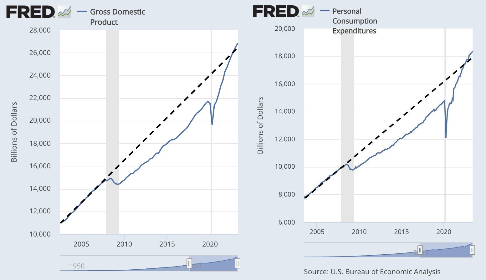
To some, the implication of these charts is that the recent expansion has in some sense finally healed the wounds of 2008. The narrative here is that we didn’t do enough fiscal stimulus in the Great Recession, and this caused permanent harm to our economy, which we finally made up for by spending a ton of money in and after the pandemic.
But while I do think we should have done more stimulus in the Great Recession, the notion that pandemic spending has healed our economy seems highly suspect. As economist Arpit Gupta and others pointed out, the frying pan graphs only look like frying pans when you forget to account for inflation. Mike Konczal redid the graphs in real terms, and found out that they don’t look like frying pans at all:
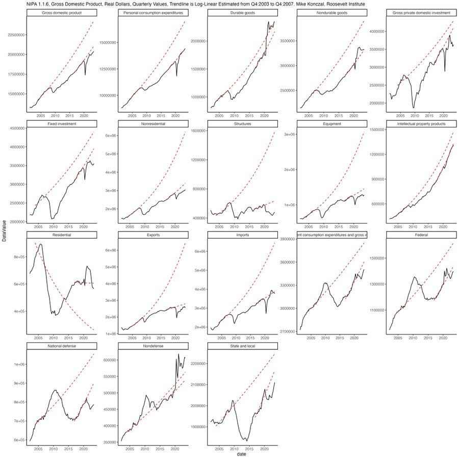
In other words, the Great Recession seemed to either cause or herald a long-term slowdown in the U.S. economy. The recent massive burst of pandemic-related government spending helped push up prices, but it did not return real production or consumption to their pre-2008 trends. In fact, slower productivity growth since around 2005 or so is probably a big reason why government spending pushed up prices — we didn’t have the capacity to stimulate.
We should probably focus on boosting productivity rather than assuming that the economy’s long-term trajectory is a result of short-term fiscal policy.
3. The quiet tech bust
The massive wave of hype around AI has concealed a deeper, longer-term bust in the tech sector. The wave of layoffs at big tech companies has slowed, but in the world of venture capital and startups, there are reasons to think the pain is just beginning.
We can see the impending bust in startup valuations. The rate of creation of new “unicorns” (private companies worth over $1 billion) is just one seventh of what it was in 2021, and a quarter of what it was in 2022. Funds raised from IPOs have completely cratered since late 2021. VC funding overall is less than half of what it was two years ago:
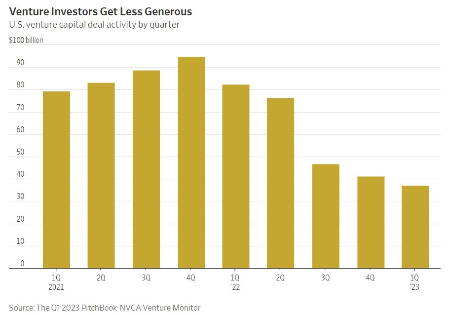
That’s just for the U.S., but worldwide funding is seeing a similar dropoff.
The VC pullback will eventually mean carnage in the startup industry, which so far has avoided some of the layoffs that Big Tech did in 2022. Many startups are burning through their cash, but unable to raise more, and thus headed for the graveyard over the next couple of years. Even some unicorns are biting the dust.
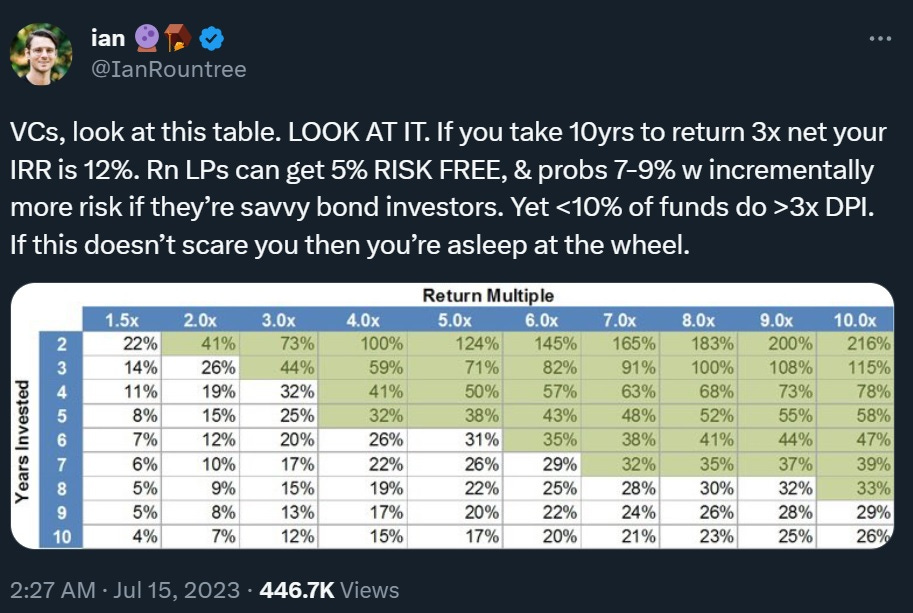
Why all the carnage in VC? There are probably a number of reasons. First, of course, there’s macroeconomics. Here’s a good thread from Ian Rountree showing how hard it is to make money in VC with interest rates at 5%:
Some big bad bets by VCs have also come home to roost, which is probably making those VCs either unable or unwilling to deploy money at previous rates. Crypto in particular was a gigantic bust, with firms like Sequoia taking some enormous losses and pulling back heavily in the sector.
Research also tells us that most VC firms just aren’t that good; the big ones make money while the long tail of small VCs tends to underperform public markets. High fees — “2 and 20” is still the standard in VC — mean that the LPs who invest money with VCs tend to do even worse. Venture firms are probably able to charge these fees because the percent of their total assets that many LPs allocate to VC is relatively small. The price of that funding model is risk; when the tide goes out, what looks to an LP like a small reallocation away from VC can mean a huge percentage reduction in the funds VCs have available.
A final reason for the VC pullback might be simply the end of the social/mobile boom. Kyle Harrison had a guest post at Eric Newcomer’s blog a couple of months ago arguing that a lot of people in the industry just got used to mindlessly throwing money at internet companies, and are now pulling back because they realize those opportunities aren’t nearly as good as they used to be:

Will generative AI be enough to make up for the effective completion of the internet itself? We’ll see, I guess, but so far that’s more of a hope than a reality. If generative AI isn’t the world-transforming tech that some people think it will be, then the long-term future of VC over the next couple of decades could be a general pullback coupled with a pivot to deeptech, as technologists look around for the Next Big Thing.
4. Why the turn against meritocracy?
I’ve been writing recently about the general turn against math education; progressive advocates think that teaching kids less advanced math will lead to more equitable outcomes, but in fact the opposite is far more likely. The progressive turn against advanced math coincides with a more general revolt against academic meritocracy, with most U.S. colleges scrapping mandatory standardized testing. This is also highly likely to backfire in terms of advancing equity, since standardized tests tend to be less biased toward rich kids than other admissions criteria like essays. Recent work by Chetty et al. shows that in general, academic admissions criteria favor the rich far less than subjective measures like extracurricular activities, guidance counselor ratings, and teacher ratings.
Most commentators see the progressive turn against meritocracy as a simple mistake — an increased concern for equity that’s being directed into counterproductive policies. But while I’m sure that’s part of the story, I see something a little more sinister going on.
Over the last three decades, increased high-skilled immigration from Asia (and the Middle East and Africa, but especially Asia) has resulted in a large increase in the number of talented, motivated kids with parents who strongly encourage them in the academic field. These kids naturally in competition for college spots with the kids of the educated White progressives who make up the backbone of the progressive movement. Despite the fact that progressives are (at least on paper) strongly pro-immigration, upper middle class White families probably aren’t particularly eager to see their kids outcompeted by the hard-charging children of immigrants. Turning against meritocracy, and toward more subjective admissions criteria that favor family wealth over talent and hard work, seems like it would be a natural way for educated White progressives to defend their position in the American class system.
There is some evidence to support this theory. University of Miami sociologist Frank Samson did a study a decade ago in which he showed people information about the increasing number of Asian students in U.S. colleges. When they saw this trend, Samson’s White subjects tended to tighten their standards toward Asian college applicants and loosen their standards toward White applicants, while his Asian subjects didn’t change their criteria at all. This is from the abstract:
I explore how demographic changes at a prestigious public university in the United States affect individuals’ evaluations of college applications. Responding to a line graph that randomly displays a freshmen enrollment trend toward a white plurality or an Asian American plurality, white student evaluators lower their minimum class rank standard for admitting white applicants when exposed to an Asian American plurality trend. They also raise the minimum test percentile standard for admitting Asian American applicants. Notably, plurality trend does not affect Asian American student evaluators’ minimum standards for recommending admission. Applications differed only by applicant race.
This is evidence that White people perceive Asian college achievement as a threat — or at least, that they did a decade ago. What we don’t have, yet, is direct evidence that White people understand that moving from “hard” to “soft” admissions criteria privileges White applicants over Asian ones. But with the recent Supreme Court case striking down affirmative action, it seems like this idea would be rather hard to ignore.
In other words, back in the 80s, or even the 90s, academic meritocracy helped educated White people secure their position at the top of America’s hierarchy of money and success. But decades of high-skilled nonwhite immigration really changed the game, and so now some educated White people probably want to change the rules of the game to ensure they keep winning. And if the rule changes can be couched in the progressive language of equity, so much the better.
5. Four climate facts to think about
Here are four charts that show what I consider to be important facts about the climate situation. First, U.S. carbon emissions in 2021 were down to the levels of 1979:

Perhaps a third of this is due to fracking, with the rest being due to the rise of solar and wind and to improvements in energy efficiency.
Of course the U.S. population has been increasing over that time. Per capita emissions are down even more — back to the level of 1912:

One factor that doesn’t help account this decline is the offshoring of emissions to other countries. Lots of people claim that this is driving the change, but they’re simply wrong and misinformed. The U.S. offshores only a very small percent of its emissions, and the amount we offshore has actually gone down since our overall emissions started falling in the mid-2000s.

In the comments in my previous roundup, Max Kummerow asks how we can be optimistic about climate when global emissions continue to grow. Well, the good news is that the U.S. shows that economies can still grow while decarbonizing, without offshoring their emissions. The bad news is that China is not choosing to do this. My fourth chart is a comparison of U.S. and Chinese emissions:

You can talk all you want about per capita emissions, and cumulative emissions, but moral responsibility and finger-pointing and blame are things that the climate doesn’t care about at all. The blunt fact is that if China doesn’t stop burning coal, the whole planet is in big trouble. There is simply no way around that fact, so we have to think of ways to deal with it. Persuasion is unlikely to have big effects here, since China has vowed to “go its own way” on climate, and China itself is already doing most of the work of driving down the global price of renewables. So in terms of what the U.S. and Europe can do to get China to reduce its coal usage, carbon tariffs might be a good place to start.
Counterintuitively, preserving meritocracy is one of the reasons we should pursue more economic and social egalitarianism. When the child of two rich lawyers gets a C+ average and gets some office job and it’s a mild drop in the child’s status and not “Oh god how will our child ever afford a home” then rich parents will be more willing to let the chips fall where they may and will be less tempted to put their fingers on the scale.
Love seeing Noah discussing the connection between progressive anti-meritocracy and Asian immigration. It’s been one of those things that I know people must notice, but too few on the left have talked about openly.