At least five interesting things for your weekend (#26)
The U.S. economy, U.S. energy, Millennial wealth, medical administrators, and standardized tests
Howdy, folks! It’s time for Noahpinion’s quasi-weekly roundup.
First, podcasts. I’ve been doing a whole lot of these lately. First, I went on The Realignment and talked about politics and international relations with Marshall Kosloff. My recent post about Trump was inspired in part by this discussion. Here’s a Spotify link?
And here are Apple Podcasts and YouTube links, if you prefer.
Erik Torenberg and I also did two episodes of Econ 102. Episode 27 was a discussion with asset manager Itay Vinik about whether a recession is coming. This one inspired my post about the yield curve:
And Episode 28 was Erik quizzing me about Japan’s economic situation, which I plan to write a lot more about soon:
Here are Apple Podcasts and YouTube links to Episode 27, and here are Apple Podcasts and YouTube links to Episode 28.
Finally, Brad and I have a new episode of Hexapodia! It’s all about economic development. We spend a bit of time criticizing last year’s interesting but very wrong post by college kids David Oks and Henry Williams, but we spend most of our time talking about Dani Rodrik and Joseph Stiglitz’ thesis that automation spells the end of labor-intensive manufacturing-led industrialization:
Anyway, on to this week’s list of interesting things. Our theme this week is “good news about the U.S. economy”.
The U.S. economy is starting to look like the 90s
I’ve been banging this drum a lot recently, but it still never ceases to amaze me how well the U.S. economy keeps doing. The post-pandemic inflation has now been completely conquered:
In particular, rent has now come down. A report by Realtor.com finds that median rents have fallen for 8 straight months now, caused in part by a boom in new apartment construction. (Yes, it turns out that YIMBYs are right and increasing supply makes housing more affordable.)
Meanwhile, despite interest rate hikes, real economic growth is powering forward in the U.S., coming in at 3.3% in the fourth quarter of 2023 (after an amazing 4.9% in the previous quarter). Labor productivity and real wages are up, and employment rates are still very high. Even Breitbart is trumpeting the good economic numbers.
And on top of that, the stock market is doing great. The S&P 500 is up 20% over the past year, and just hit a record high, at least in nominal terms.
The amazing thing is that this is all happening with interest rates at 5.5%! Since inflation is going down, and the labor market looks a little less tight than a year ago, the Fed is likely to cut rates this year. That will probably boost the economy, and the stock market, even more.
The U.S. economy hasn’t been this good since the 1990s. It’s really a Goldilocks situation; things pretty much never get better than this in a developed country. Of course, 2022 was a difficult year in many ways, so it’ll take some time for consumer sentiment to recover from that shock. But objectively, the U.S. is firing on all cylinders.
Update: Ben Carlson has a good post on this.
The U.S. is swimming in energy supply
One other reason to expect good things for the U.S. economy is that energy supply has been increasing. Massive investment by U.S. shale oil producers has sent production soaring:
Pump, pump, pump pump it up! is what American oil producers have been saying for five years straight, since a prodigious increase in crude oil production in shale country helped make the US the largest crude pumper in the world…
“US oil supply growth continues to defy expectations,” the International Energy Agency said in its latest Oil Market Report, released Thursday (Jan. 18). The US is producing more oil than any country in history, some 13 million barrels of it per day[.]
And here is a chart:
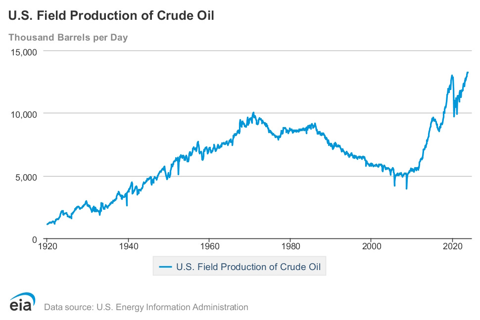
Currently, all this U.S. oil drilling is keeping prices at moderate levels in the face of OPEC cuts. Eventually, OPEC — which has dwindled to less than half of global supply, even with the new “OPEC+” additions — will realize that all it’s doing with these production cuts is draining its own coffers. If OPEC gives in and starts pumping more, the world will experience an oil glut and the economy will get a shot in the arm.
Hilariously, some Republicans are trying to claim that the U.S. isn’t drilling for oil, or that Biden has damaged U.S. energy independence. This is a complete fantasy, and the people making this fantastical claim are rightfully getting hit with Community Notes correcting them. It’s boom times for U.S. oil.
Biden has also paused approvals for new liquefied natural gas export facilities. This will hurt producers a bit, since it shrinks their market. But it’ll also lower prices for U.S. utilities, because natural gas producers will only be able to sell domestically. That should boost the U.S. economy at the expense of Europe.
Now, a lot of people won’t like these moves. Drilling for more oil exacerbates climate change, while limiting LNG exports hurts some of our allies. But they will both probably reduce electricity costs and heating costs for U.S. businesses and consumers, thus reducing inflation even more.
And those who are mad about climate change can take some solace in the fact that the U.S. is also continuing to build solar power and battery storage at a very rapid rate, despite the hurdles created by NEPA, CEQA, and grid interconnection difficulties. Solar is proving especially important in Texas, where it helped the state weather a recent cold snap.
In other words, the U.S. is entering a new age of energy abundance. The Biden administration should probably trumpet that achievement more than it’s currently doing.
Update: Catherine Rampell has a good post on this.
Some new numbers on Millennial wealth
Last year I wrote a post arguing that the Millennial generation is doing well economically. A few months ago I wrote a post about the newly released 2022 Survey of Consumer Finances, and how it shows that Americans have become wealthier in recent years. Anyway, Jeremy Horpedahl has a new post putting these two facts together, and showing that wealth for the younger generation is doing far better than for previous generations at a similar age. Here’s the key chart:
Horpedahl’s young generation is actually now a combination of what people usually mean when they say “Millennials” and “Gen Z”. Basically, it’s the group of young people for whom the median age is 30. So really, when you’re looking at this graph, you’re looking at the average per capita wealth of 30-year-old Americans.
Note also that this is a semilog graph. That means that although the orange line is just slightly above the green line, this difference is actually a factor of 2 — 30-year-olds now, on average, are about twice as rich as they were in the previous generation.
This is great news, but there are couple of caveats. This wealth number is an average, not a median, meaning that it’s concentrated in the hands of the rich, as wealth always is (though wealth inequality has gone down a little bit over the last decade). Second, people usually build most of their wealth in their 30s and 40s, so the economic story of this young generation has not yet been written.
And what kind of wealth do Millennials have? About 40% is real estate, which is a little more than previous generations, because Millennials’ stock portfolios haven’t had time to grow yet:
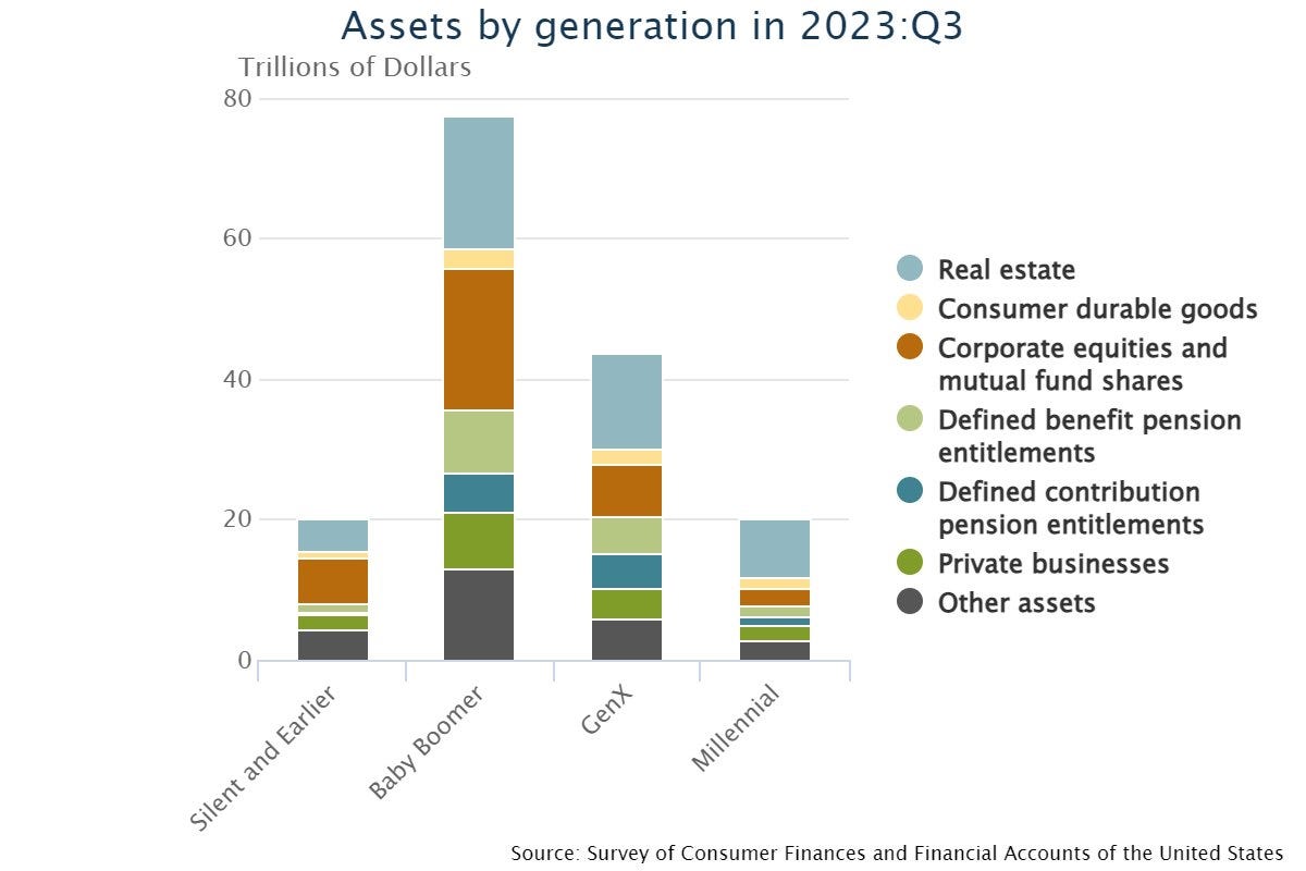
The generational comparison looks the same if you exclude real estate (though I’m not sure why you’d want to exclude real estate, since it’s been a major pillar of Americans’ wealth for many generations).
So anyway, this is yet more good news for America’s economy. The generational wealth escalator has not broken down.
The viral chart about medical administrators is wrong
A few months ago I wrote Part 1 of my guide to How Not to Be Fooled by Viral Charts:
I still need to write Part 2 of that. But in the meantime, here’s an opportunity to apply the lessons from that post.
In 2019, economist Timothy Taylor, managing editor of the Journal of Economic Perspectives, wrote a blog post about health care costs and why they’ve grown so much. In it, he cites the book Priced Out, by the celebrated health care blogger Uwe Reinhardt. Reinhardt lists growth in administrative costs as one main reason costs have grown. Taylor pulls the following chart from Reinhardt’s book:
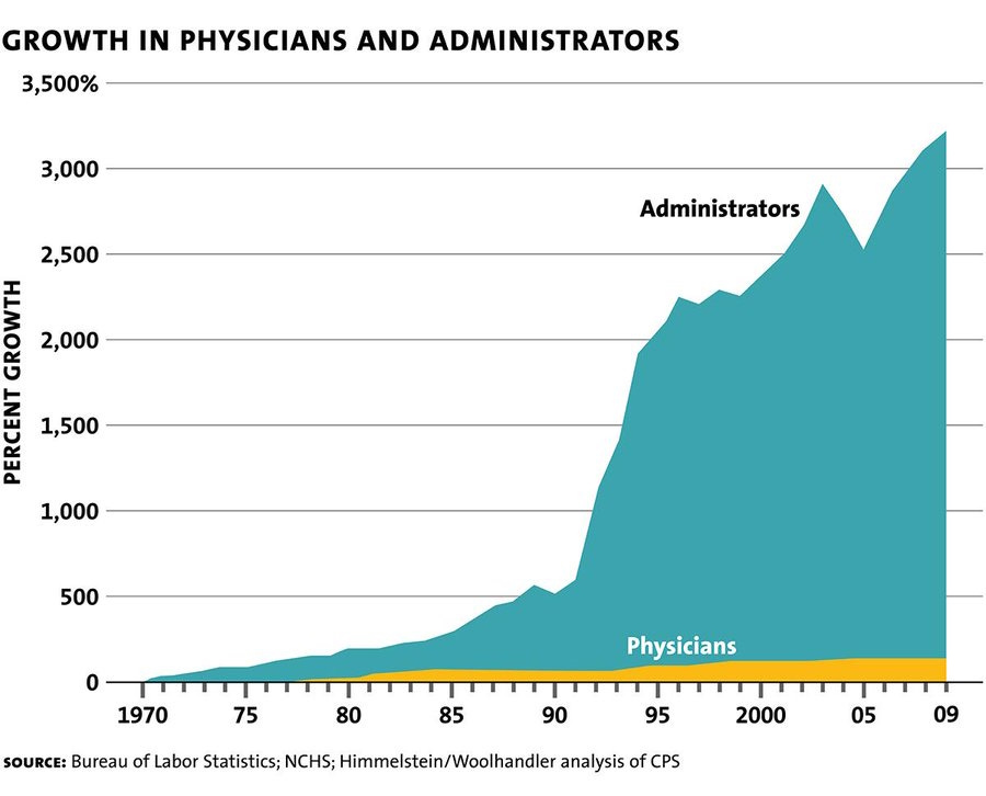
Without thinking too hard about the chart, I tweeted it out. The tweet got 1300 retweets and 2500 likes, which is not really that many, but was enough to make me mute notifications on the tweet. And because I muted notifications, it wasn’t until five years later that I learned the chart is complete B.S.
The red flag in the chart is the gigantic 350% jump in the number of administrators in the early 1990s. It’s simply impossible that so many medical administrators were hired in such a short time. This is pretty much guaranteed to be either a change in the definition of “administrator”, or (more likely) a coding error by whoever compiled the graph. Had I looked closely at the numbers, I would have realized that. But I did not look closely. Instead, that task fell to Alex Tabarrok and Kevin Drum, who wrote excellent blog posts debunking the chart.
Both Drum and Tabarrok went looking for the original source data from the graph, and failed to find it. The alleged source is a team of researchers, Himmelstein and Woolhandler, who wrote many papers over the years. Drum and Tabarrok both comb through their papers and can’t find data that matches what’s shown on the graph. Drum does find some data from Himmelstein and Woolhandler that seems to contradict what’s in the graph, at least up through the 90s. Extrapolating it out, he gets an increase in administrators of around 831%, rather than the >3000% in the viral chart:
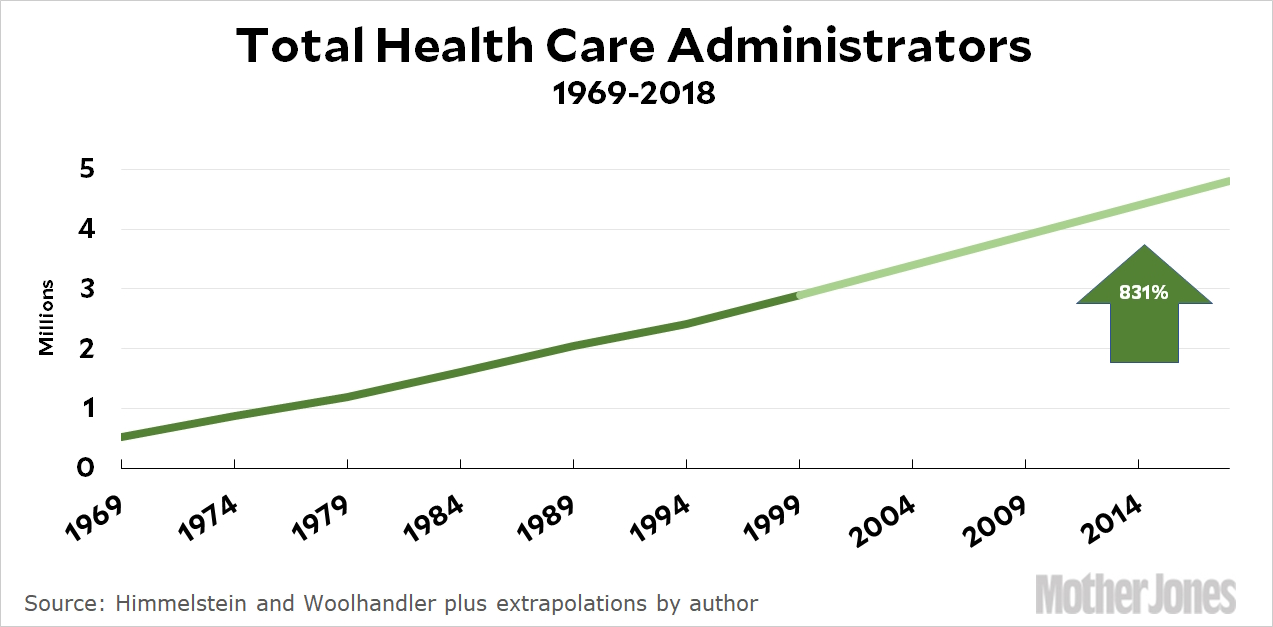
He then goes back and — heroically — attempts to do his own version of the chart, pulling data directly from the Bureau of Labor Statistics and deciding who counts as an administrator. He then makes his own version of the chart that shows administrators increasing by about 1115%, similar to what he gets by extrapolating Himmelstein and Woolhandler, and about a third of the increase shown in the viral chart.
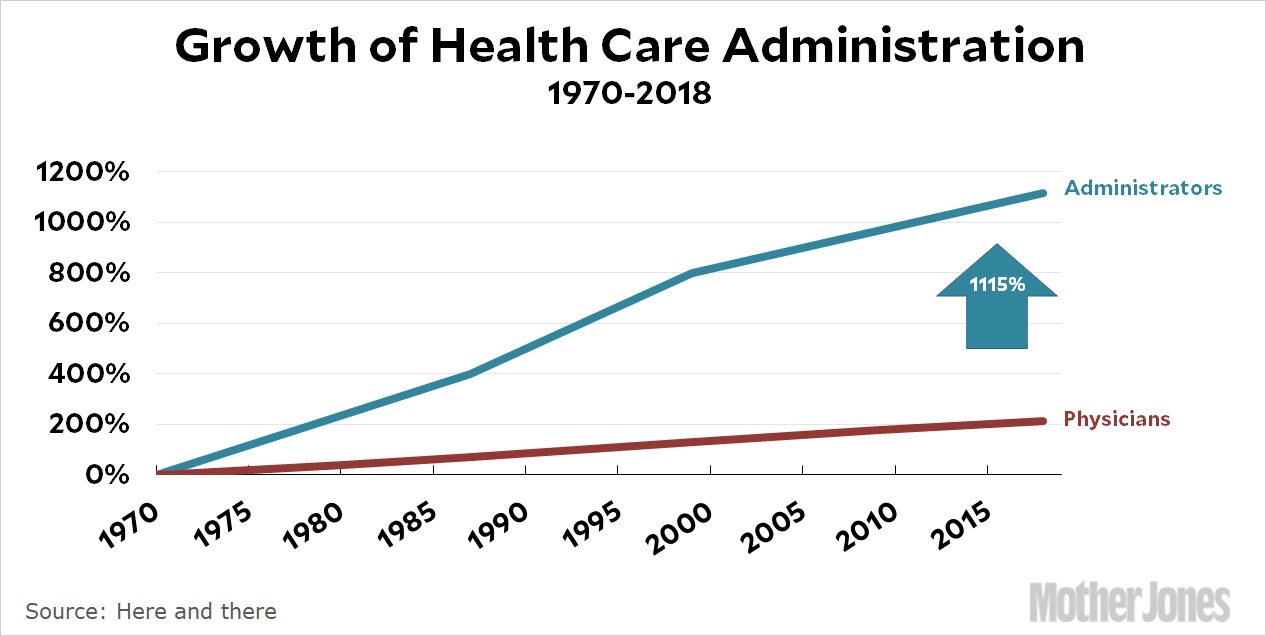
Tabarrok, meanwhile, points out that these large percentage increases depend crucially on the starting point in 1970, when A) data wasn’t as good, and B) the number being estimated was small and thus subject to large percentage errors:
Everything in this graph depends on getting one number, the number of administrators in 1970, exactly correct! But the first number is the one that is the farthest in the past, often the hardest to find and the most suspect. But if that first number is underestimated then every other number in the chart is overestimated.
Anyway, note that the basic story from the viral chart — administrators increasing faster than physicians over the last half century — is correct. The chart simply exaggerates the increase. Whether or not the rise in administrators relative to physicians is a necessary change in light of changing technology, or an inefficient response caused by bad policy and general complacency, is an open question.
But the basic lesson here is: Just because a chart tells a plausible story, or even a correct story, doesn’t mean it’s a good chart. Look carefully to see whether the numbers are quantitatively plausible, even if the chart comes from reputable sources.
Standardized tests really are useful
Over the last few years, many colleges have abolished standardized testing requirements. This might represent a lowering of standards in response to shrinking demand for college, or a capitulation to activists who claim that standardized tests favor the children of the rich too much. In any case, David Leonhardt of the New York Times wrote an excellent article about how the push to drop standardized testing is misguided. He pulls data from a number of academic sources to show that:
Standardized tests predict college grades, even though their correlation with high school grades is much weaker.
Standardized tests predict who gets into grad school and who gets a top job after college, and they predict this much better than high school grades do.
Here is a graph from his article:
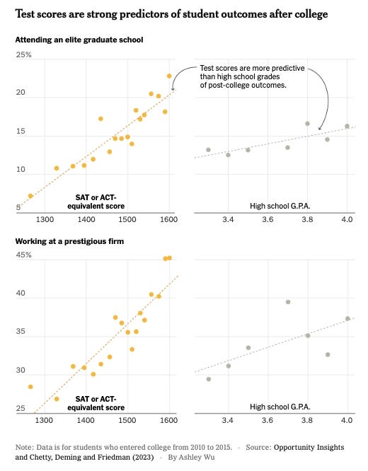
It’s a devastatingly convincing case. Nevertheless, University of Washington economist Jake Vigdor still attempted to challenge Leonhardt’s article in a Twitter X thread. His attempted rebuttal, however, was pretty weak, and its weakness ultimately ended up reinforcing the strength of Leonhardt’s case.
Vigdor does make one good point, which is that the lines in the graph above exaggerate the degree to which test scores explain the data. The points in the graph are the averages of groups of students, rather than students’ actual scores. If you plot students’ actual scores, the regression still explains a substantial percent of the variance, but it’s much less visually striking.
Vigdor’s main argument is that test scores don’t explain much of the outcomes here (college grades, grad school, job finding). He notes that the R-squared of the regression for college grades is only 0.193. But that’s actually a pretty high R-squared, as cross-sectional regressions in economics go! If you have a variable that explains 20% of outcomes, you definitely want to look at that variable!
But Vigdor also makes an oversight here. The regression he looks at is only for students who were admitted to college. Looking only at the test scores of students who got into college will reduce the explanatory power of test scores, because it ignores all the people whose scores weren’t good enough to get into college!
As an analogy, imagine if you looked at the correlation between height and performance for people who play center in the NBA. And suppose you found that the correlation existed, but wasn’t that strong, so you concluded that someone who’s 5’2” could play center almost as well as someone who’s 6’10”. This would be a bad conclusion, since someone who’s 5’2” never would have been picked to play center in the first place!
Finally, Vigdor shows that where a student went to high school is an even more powerful predictor of college grades than their scores on standardized tests. But this is an odd argument, for a couple of reasons. First of all, if you’re looking for talented kids from disadvantaged backgrounds — which is an oft-cited advantage of standardized tests — then you probably don’t want to pick students based on the fact that they went to a fancy high school. Second, according to Vigdor’s regression table, the inclusion of high school as a control doesn’t make standardized tests redundant. In fact, controlling for high school reduces the effect size of test scores by only a very small amount, compared to regressions that include other controls:
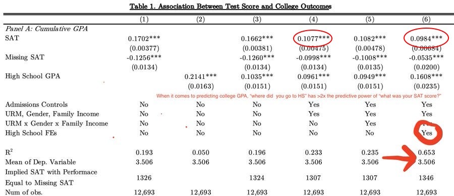
At best, Vigdor shows that standardized tests aren’t the only thing you want to look at when deciding admissions. But who in the world thinks they are? The point of Leonhardt’s article — which Vigdor actually concedes — is that standardized tests are an important tool for evaluating college applicants. Vigdor strawmans Leonhardt by claiming that Leonhardt’s thread “might lead you to believe” that test scores are all we need. But this is unfair in the extreme, because that’s explicitly not what Leonhardt is arguing:
If this is the best rebuttal that can be made, it’s a testament to the strength of Leonhardt’s case. Standardized tests are useful and important for college admissions, and we shouldn’t drop them.



I have to say I think the reason elite colleges are dropping standardized tests is mostly that it makes it harder to sue them over admissions practices. Students for Fair Admissions v Harvard relied on having SAT/ACT scores to show the admissions process was biased against Asian-Americans. You can't do that without test scores!
Basically, people (especially left-wing people) are inclined to trust college administrators and view them as "one of us," but they absolutely should not do that. College administrators are every bit the slippery, dishonest C-suite types CEOs are.
I think it's time for a moderate version of supply side economics. Rather than the Reagan era version that for some reason focused on tax cuts (when all you have is a hammer...), we should keep talking about how good the increasing supply of energy, housing, and other goods and services is for the economy. Education and cognitive labor in general seem like they will also see a huge expansion in supply with the advent of ever-better AI.
What's left? We're just getting started on housing, so there's a lot more work to do there. Healthcare, elder care, and childcare seem like tricky ones. I'm not betting on humanoid robots coming through in those areas any time soon. New wonder drugs and personalized therapies will help... Maybe we just need to make society so much richer with everything else we're doing that we can afford a few sectors that still suffer from Baumol's?