
Service costs aren't exploding anymore
Another common economic narrative that's out of date.


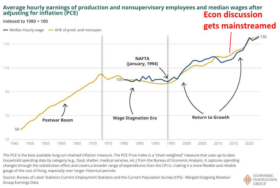
In the 2010s, economics discussions went mainstream. Blogs and (especially) social media meant that data-driven, high-level debates about economic issues were no longer confined to the op-ed pages of the Wall Street Journal and the talking heads on CNBC. This was a good thing, but I think it had some unintended consequences. One is that a lot of the narratives that made sense in 2012 or 2015 got embedded into the popular consciousness, and have stayed there even though the underlying reality has changed.
One big example of this is wage stagnation. In the early 2010s, lots of people “knew” that American middle-class wages had stagnated since the early 1970s, with only a brief temporary revival in the late 90s. And so naturally, a lot of discussions revolved around how to fix that. But even as we were having those arguments, wages accelerated again. Now, when we look back with the benefit of ten more years of hindsight, the years since the mid-1990s look like a bumpy but substantial increase:
Another big narrative, related to the wage stagnation idea, is that service costs are relentlessly rising in the U.S. economy. You’ve probably seen some version of Mark Perry’s famous “price changes” chart:
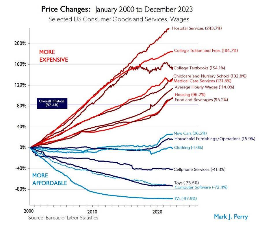
This chart tells a simple, powerful story: Services get more expensive, while physical goods get cheaper. Health care, education, and child care went up in price faster than wages, while cars, clothing, electronics, and toys got more affordable.
And the story was compelling because it came with a simple theory to explain it. This was the notion that manufacturing productivity naturally increases faster than service productivity. Conceptually, it seems easier to figure out how to rearrange production processes in a factory, and apply new machine tools, than to figure out new ways to educate kids or take care of Grandma.
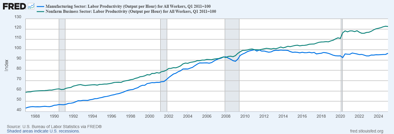
And during the 20th century, this principle held true. For example, from 1987 to 2011, manufacturing productivity more than doubled, while overall productivity increased by only 70%:

In fact, if you look on Wikipedia’s page for “Baumol’s Effect”, also known as Baumol Cost Disease, it lists this productivity divergence as an explanation for diverging costs.
If service costs rise relentlessly while manufacturing costs fall, it portends a grim future — one where we have cheap gadgets, but where the big necessities of modern middle-class life are increasingly out of reach. And in fact, that was the story a lot of people were telling in the mid-2010s.
That story led to a certain techno-pessimism. If technology could give us cheap gadgets, but couldn’t make the basics of modern life any cheaper, what good was it? The failure of educational technologies like online education only seemed to drive the point home — it seemed like we’d always just be stuck with a teacher giving lectures on a board to 20 or 30 kids. Though some people dreamed of robot nurses and nannies, these seemed very far from materializing.
It also fed into cynicism about trade. If China gave us cheap gadgets but we were still struggling to pay for health care and education, wasn’t globalization sort of a booby prize? I think we see echoes of that sentiment in the GOP’s willingness to embrace Trump’s tariffs.
On the policy side, rising service costs led to two different big ideas.
First, if technology couldn’t make services cheaper, some people (including myself) reasoned, we should use policy to make them cheaper. Perhaps deregulation was the key — many libertarians blamed rising service costs on a policy of “cost disease socialism” that restricted supply while subsidizing demand, implying that we just had to eliminate the supply restrictions and cut the subsidies and the market would do its thing. Progressives advocated a more statist approach — after all, most other countries have some form of national health insurance, and they all have cheaper health costs than America does, so perhaps government bargaining power was the key to driving costs down. (Personally, I supported doing both approaches in parallel.)
The second big policy idea said that what we want isn’t necessarily for services to cost less to produce; what we want is for services to cost less to the people who consume them. Productivity improvements in the service sector would just throw human beings out of work, as they had done in manufacturing; instead, a future where everyone gets a high-paying job taking care of everyone else sounded pretty good to some progressives.
So how do we make services cheap to consume, but keep using “care jobs” as the future of good-paying middle-class work? Taxes and subsidies were how progressives planned to square that circle. If rich people could be taxed at much higher rates, that money could be used to create higher wages and more jobs for care workers and lower prices for consumers. For example, here’s what Heather Boushey, one of Biden’s most influential economic advisors, told the Aspen Institute in 2021:
“This year has taught us all, across the nation, how the care economy is the foundation of our economy,” Boushey remarked…Boushey reflects on the twin crises of a lack of good care and a lack of good jobs and notes that investing in the care economy creates a positive feedback loop that allows family caregivers to find quality care and care workers to find quality jobs.
Natalie Foster and Amanda Newman wrote that “policy [should] contribute to building a care economy that dignifies the work of caregivers and expands access to quality, affordable care”. Felicia Wong of the Roosevelt Institute endorsed the idea of universal child care as part of a new New Deal.
This idea represented a substantial portion of Biden’s economic plans. The Build Back Better bill — which never made it into law — would have created a national family and medical leave program and a universal pre-kindergarten education, while heavily subsidizing child care and various in-home services. The total price tag would have been in the hundreds of billions of dollars. This big push for service subsidies was mostly defeated in Congress, though some health care subsidies did make it into the (misnamed) Inflation Reduction Act.
In other words, the trend of increasing service costs defined many of our economic debates for a decade. There was just one small problem — by the time we started talking about how to address this trend, the trend had changed.
Health care costs have leveled off
I’ve been meaning to write this post for a while, but what prompted me to finally do it was when Matt Yglesias posted a very nice chart of health spending as a percentage of GDP. Here’s a version of that chart with two different measures of health spending:
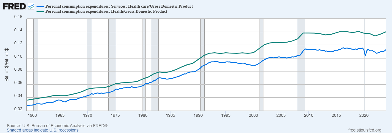
Note that “personal consumption expenditures” includes spending on behalf of consumers by the government and by nonprofits, so this isn’t just household spending on health care — it’s all of it.
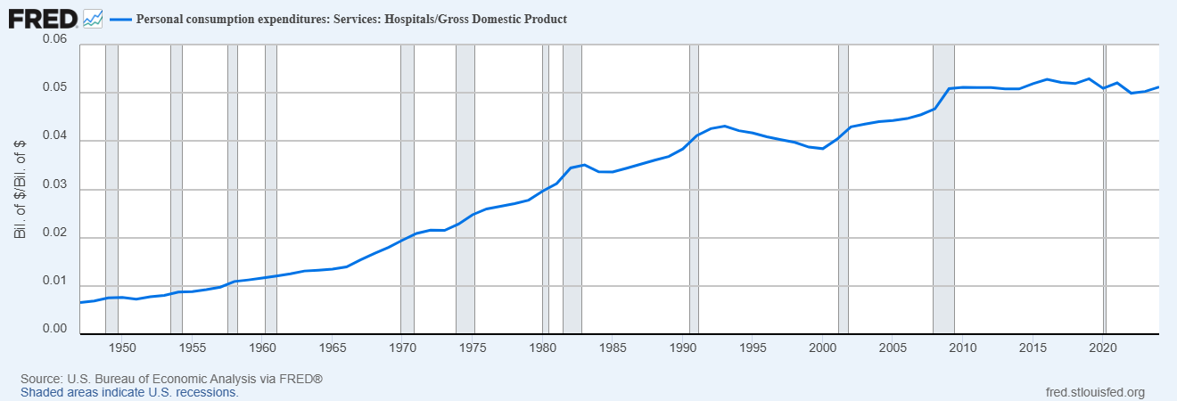
We also see the same pattern when we look only at hospital services — the item whose cost went up the most on the Mark Perry chart:
So what we see is that until around 1990, health spending rapidly ate up a bigger and bigger portion of our national income. Then the increase slowed down, but it did go up some more until around 2009. But after that, it leveled off; in 2024, Americans didn’t spend a greater percent of their income on health care than they did in 2009. And in fact, the increase since 1990 has been pretty modest — if you look only at the service portion of health care (the blue line), it’s gone up by about 1.5% of GDP over 34 years.
OK, so, this is total spending, not the price of health care. Is America spending less because we’re getting less care? No. In cost-adjusted terms, Americans have been getting more and more health care services over the years:

What’s happening is that although health care prices have still been going up, they’ve been going up more slowly than before. Here are health service prices relative to the overall price level, as measured with the PCE:

You can see that costs level off in 2009, and then actually drop after the pandemic relative to other costs. This doesn’t mean health care got cheaper after 2020; what it means is that health care prices rose more slowly than other prices did.
If you use the CPI (as Mark Perry’s chart does), things look a little different — medical costs keep rising faster than overall costs during the 2010s, but then slow down quite a bit after the pandemic:

Why the difference between CPI and PCE? Two main reasons. First of all, health care itself is a bigger component of PCE than of CPI, while CPI weights housing more heavily instead. So the fact that health care prices have gone up faster than housing prices means that CPI will show a greater increase of health prices relative to the total. Second, PCE tries harder to adjust for quality improvements. Health care has gone up a lot in quality over the years, and this has been hard to capture with traditional price measures. This is from the conclusion of a Brookings literature review from 2016:
Traditional measures of productivity growth in the health sector most likely understate it, because they don’t adjust prices for substitution from higher to lower cost inputs and because they don’t take account of changes in quality over time…The evidence to date suggests that adjusting health care expenditures for changes in quality leads to a significant reduction in the rise in health prices over time, and, indeed, these prices may even have declined relative to other prices.
PCE has this problem less than CPI does, so it shows more of a cost slowdown.
OK but anyway, what we really care about at the end of the day is affordability — i.e., how much health care an average America can buy. A good way of measuring affordability is to look at median income divided by an index of health care prices — in other words, how much health care the typical American can buy with their annual income.
When we look at this, we see that health care got steadily less affordable until around 1990, then leveled off, and now has been getting more affordable since around 2012:
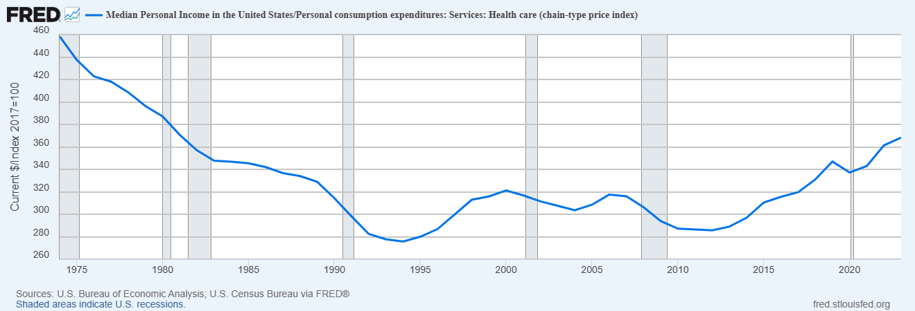
So overall, health care is probably now more affordable for the average American than it was in 2000 — in fact, it’s now about as affordable as it was in the early 1980s. That doesn’t mean that every type of care is more affordable, of course. But the narrative that U.S. health costs just go up and up relentlessly hasn’t reflected reality for a while now.
Why have health care costs stopped going up rapidly? Some credit the cost control provisions of the Affordable Care Act of 2009 (aka Obamacare). This is from 2019:
March 23, the ninth anniversary of the ACA’s passage, presents a good opportunity to examine its legacy on cost control…Fast forward to December 2018, when [the Office of the Actuary of the Department of Health and Human Services] released the official tabulation of health care spending in 2017. The bottom line: cumulatively from 2010 to 2017 the ACA reduced health care spending a total of $2.3 trillion…[H]ealth care spending in 2017 was $2,000 less per person than it was projected to be. And for the 176 million Americans who have private employer-sponsored insurance, their lower premiums averaged just under $1,000 per person.
Another possibility is that Americans just got tired of paying more and more for health care, and started balking at higher prices. People who made excuses for high American health costs claimed that it was just an income effect — that as nations get richer, they simply spend a higher and higher percent of their income on health care. But as I pointed out, at some point this explanation has to fail, because it can’t be true that health care eventually consumes all of a rich nation’s income, to the exclusion of everything else.
It could just be that Americans were willing to pay more for health care as they got richer, up to a point, but that at some point they said “OK, that’s enough.”
Higher education costs have leveled off
It’s not just health care whose costs have leveled off. College tuition is no longer getting more and more expensive every year. In fact, in inflation adjusted terms, tuition has actually fallen since the pandemic:
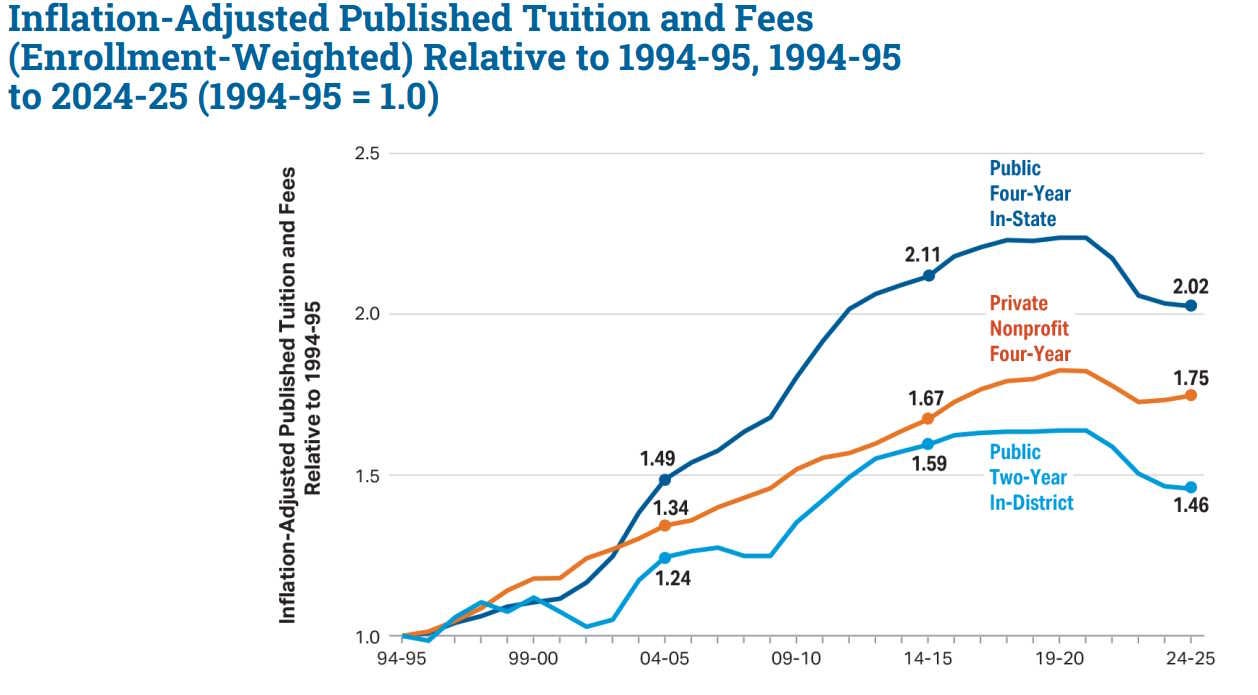
Here’s another way of visualizing that same data, and you can see that adding in housing and food doesn’t really change the story:
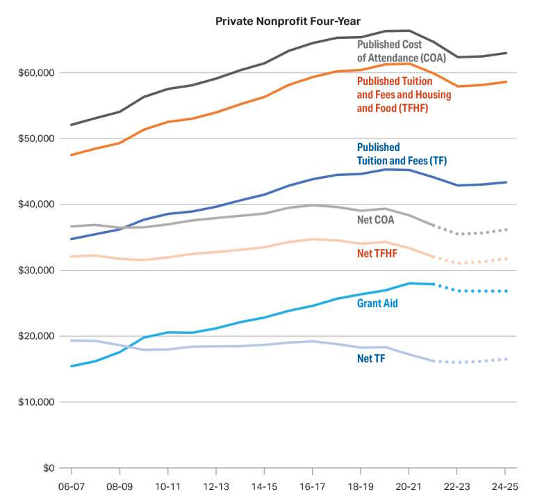
Of course this doesn’t include financial aid (nor does Mark Perry’s chart, nor do official inflation numbers). Financial aid has been going up, especially at private schools. When you include that, it turns out that private four-year nonprofits are actually less expensive in inflation-adjusted terms than they were in the mid-2000s, even without accounting for rising incomes:
For public schools it’s about the same:
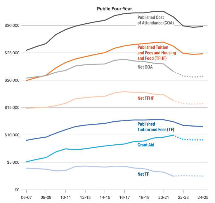
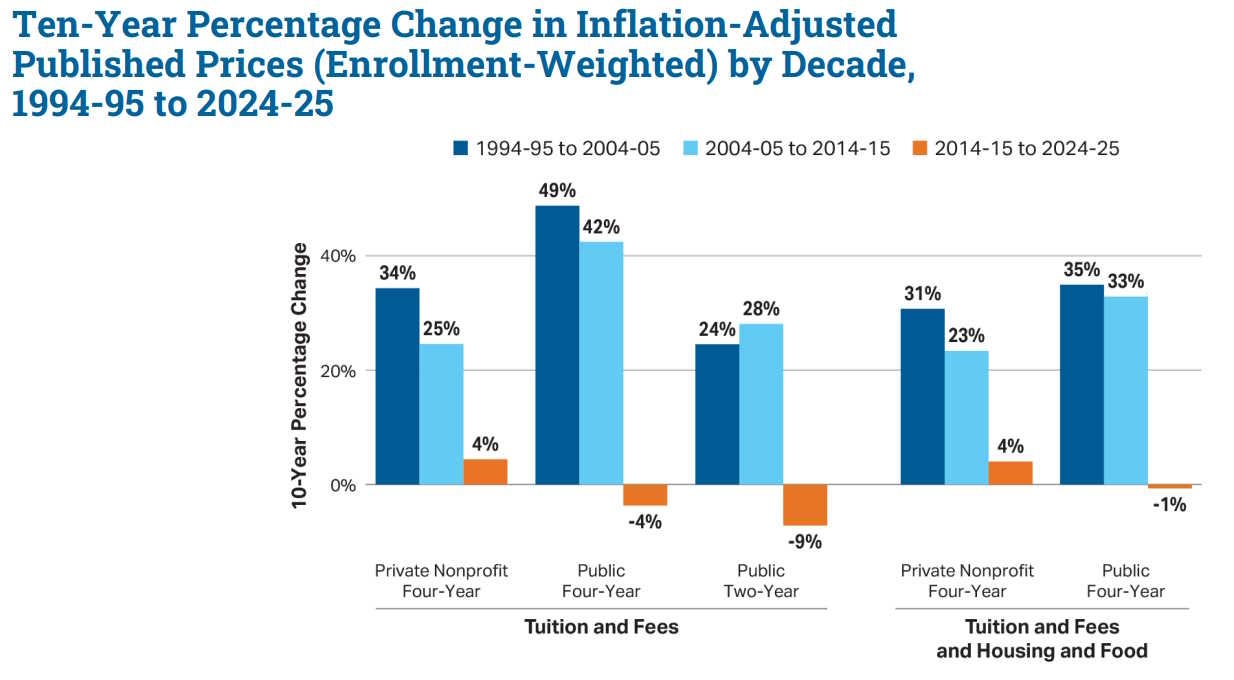
In other words, higher education has been getting more affordable for years, and the decrease in affordability in the late 2000s and 2010s was significantly overstated. The popular narrative that college is getting less and less affordable is wrong, and it needs to change.
Why are college costs going down now? It’s basically a story about demand. College enrollment peaked in 2010 and began to fall:
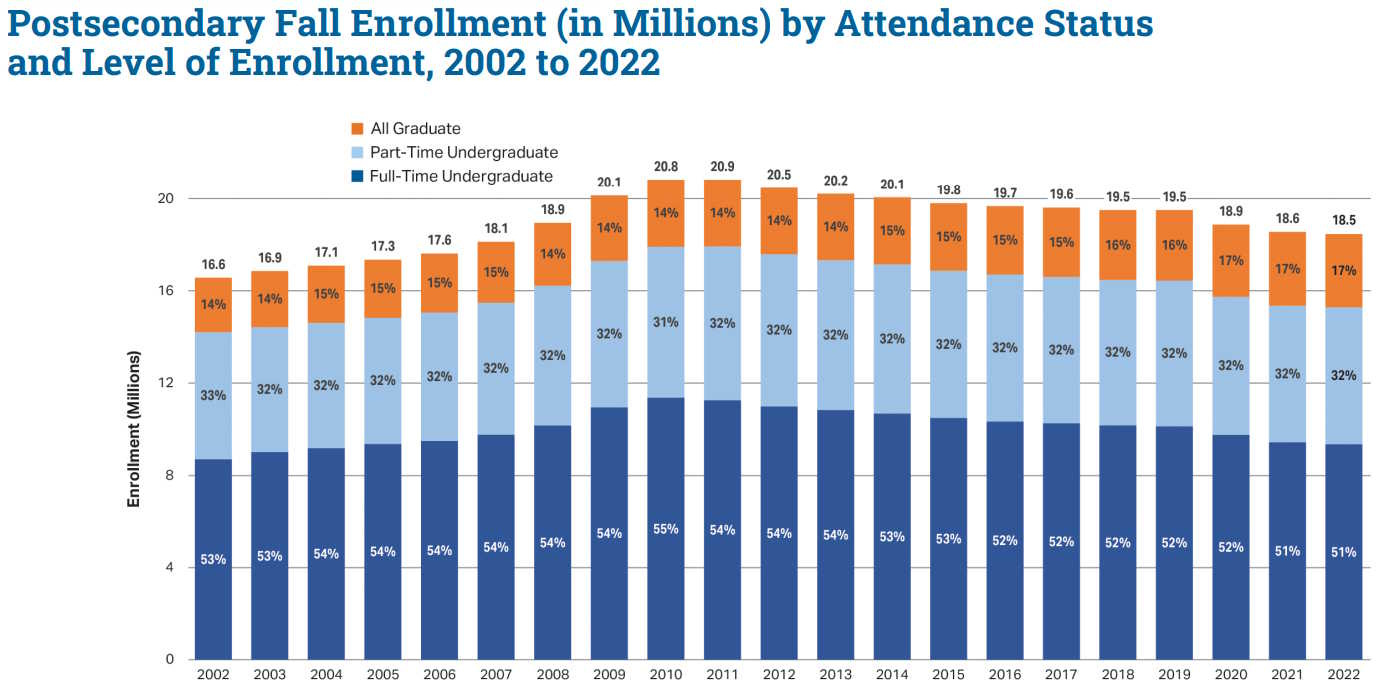
This enrollment decline happened for every age group of students. It wasn’t just because the number of young people in America plateaued, either; enrollment fell as a proportion of young people.
As for why enrollment rates declined, that’s an open question. My own hypothesis is that college costs rose and the college wage premium fell until a market equilibrium was reached.
Our debates about services need to change
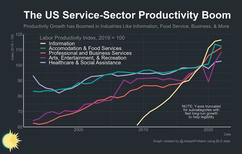
It’s not just true that service costs have stopped exploding in America. The narrative that service productivity is stagnant, while manufacturing experiences fast productivity growth, has been flipped on its head since 2008. Manufacturing productivity abruptly flatlined around the time of the Great Recession, while overall productivity has risen:
This implies that service productivity growth has accelerated. And indeed, if you look at specific industries, you see a lot of services where productivity is going up quickly in America:
Now, these changing trends don’t mean that services are cheap and we can stop thinking about service costs. First of all, there are still some services that are getting less affordable over time — most notably, child care. Second, the recent mild increases in affordability for health care and higher education haven’t erased the big cost increases that happened in the 1980s, 1990s, and early 2000s; Americans still pay a lot more for these things than Europeans or Asians do, relative to their incomes. So there’s still probably scope to bring down the costs of health care and college.
But with all that said, the change in the trends in service costs and service productivity mean that our debates about these topics need to change.
First of all, services don’t look as resistant to technological improvement as we once thought. The increased adoption of IT in health care is probably having a big effect. We can probably apply that insight to child care and K-12 education as well. And the introduction of AI into education — and everything else — will probably accelerate the trend even more.
The possibility of technology-driven productivity improvements in service industries also means that we don’t have to resort to expensive subsidies in order to make services both better-paying for workers and cheaper for consumers. Instead, we can encourage technology adoption, and enjoy higher wages and lower prices, just like we did with manufacturing in the 20th century.
(As for where the jobs of the future will come from, it’s looking more likely that professional jobs, rather than care jobs, are the next big thing.)
Falling service costs should also make us more optimistic about capitalism, and about the future of the middle class. For the last decade and a half, a lot of our economic debates have been premised on the idea that the American economy is fundamentally broken, and that life just keeps getting more and more expensive for regular people. That’s looking a lot less true than it did in 2012.
We spent a long time talking about how service costs were eating the world, and I don’t expect that narrative to disappear overnight just because I posted one blog post with a lot of charts. But it’s well past time for our discussions on this topic to start shifting in response to new information.
Years ago a network scientist named Samuel Arbesman wrote a book about this kind of thing. How there are facts that change constantly -- the weather -- so we know we need to check the latest. And there are facts that never change -- the names of the planets -- so we know we don't need to bother checking on them. But there's another category of fact he called "mesofacts" (a term which obviously failed to catch on) for facts that change over the span of a few decades and people seem poorly suited cognitively to deal with because nobody puts a Google Calendar reminder for 2035 to check the current consensus on Industrial Policy.
One unclear aspect of this interesting essay is whether it is written from the point of view of the average American household income or the median American household income. In other words, are we talking about households making $106,270 or $80,610? There's a great gap in disposable income between those two figures.
Also, I see a recurring insensitivity to past inflation. The idea that prices haven't gone up in the last five years doesn't mean that the pain has gone away. it just means that the thumb screws are no longer being tightened, after reaching the level of torture in the past. Economists seem to think that the pain of past inflation and (a continuing inflated status) evaporates instantaneously.
OTOH, it is refreshing to learn that both American higher education and American health care are somewhat responsive to market forces.